14 cases when designers cruelly mocked the appearance of bathrooms (15 photos)
For many, the bathroom and toilet are sacred places where you can relax for a while and be alone with your thoughts. In most cases, these are clean and safe areas, decorated in classic styles that do not raise questions or rejection. 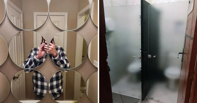
Would you like to take a relaxing bath? 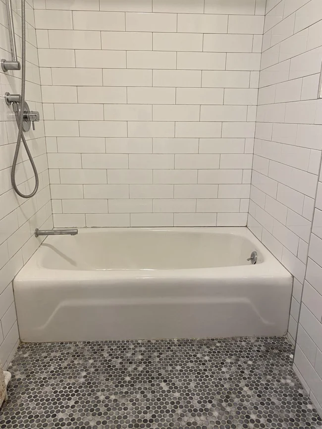
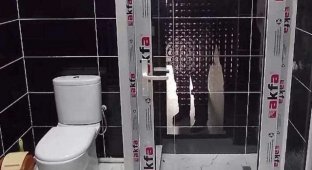
A real horror for people afraid of confined spaces.
The most "practical" design of bathroom mirrors 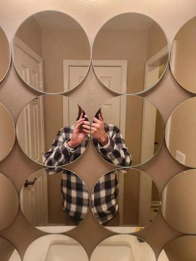
It may look stylish, but you'll clearly have to dress up somewhere else.
Glass doors in an educational institution 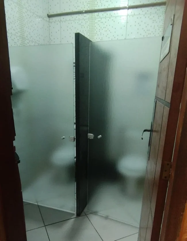
This clearly solved the issue of violation of personal space.
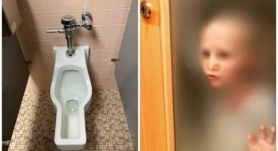
Public toilet stalls with windows. Why? 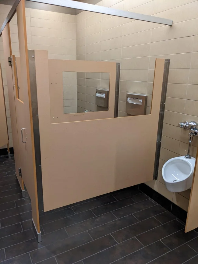
In this case, you can say nasty things to your neighbor or shower him with compliments.
A drawing on the wall in the bathroom. Is this a joke? 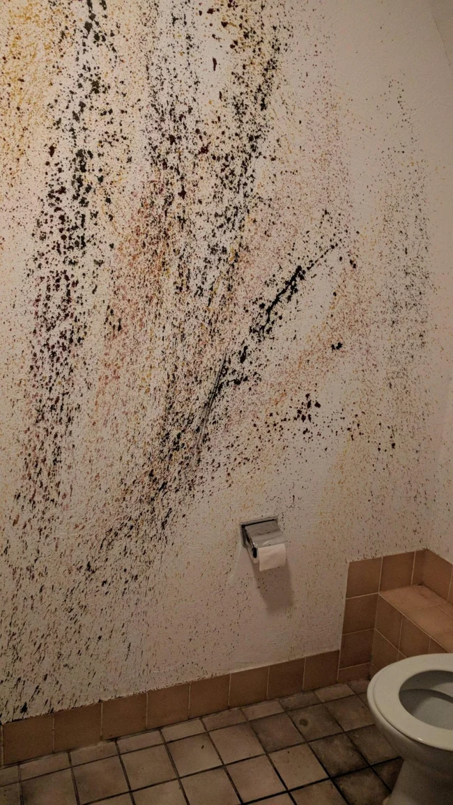
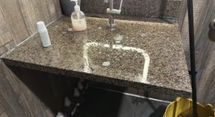
This is what a sink looks like in one of the restaurants 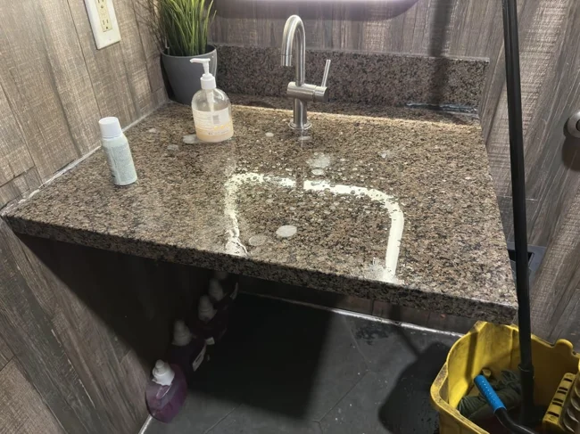
No, this is not a minimalist, avant-garde design. The water just runs off the edges onto the floor, so the mop is right there. There is not even a drain pipe under this stand.
A great addition to any home - a steel bathtub 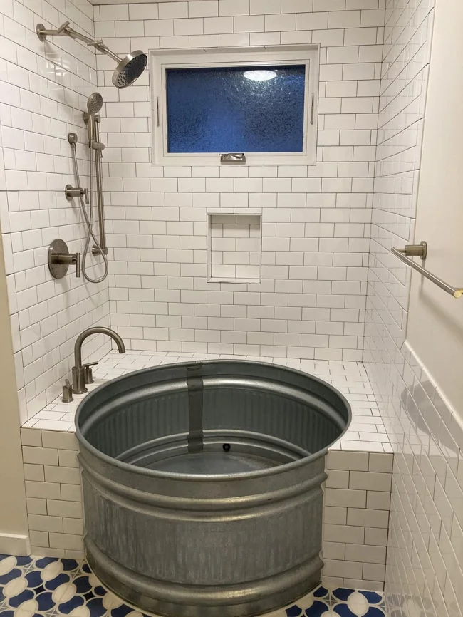
It looks uncomfortable and cold.
The sink is attached to the toilet and forms a perfect slide 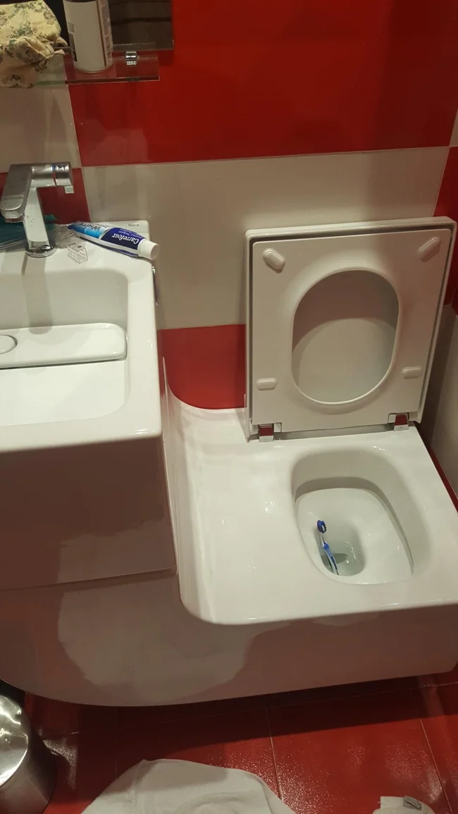
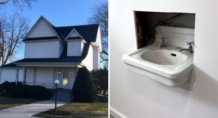
What is this? An ant sink? 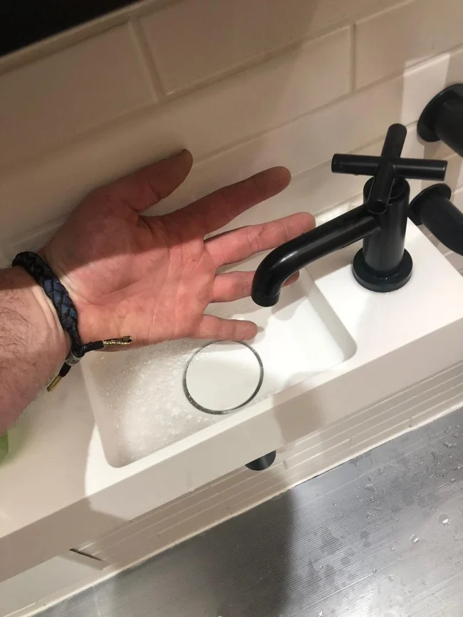
A strangely shaped toilet in a doctor's office 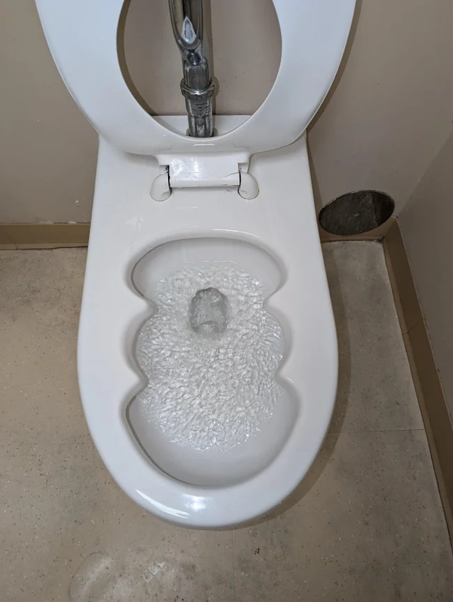
You probably won't see a more ugly bathtub today 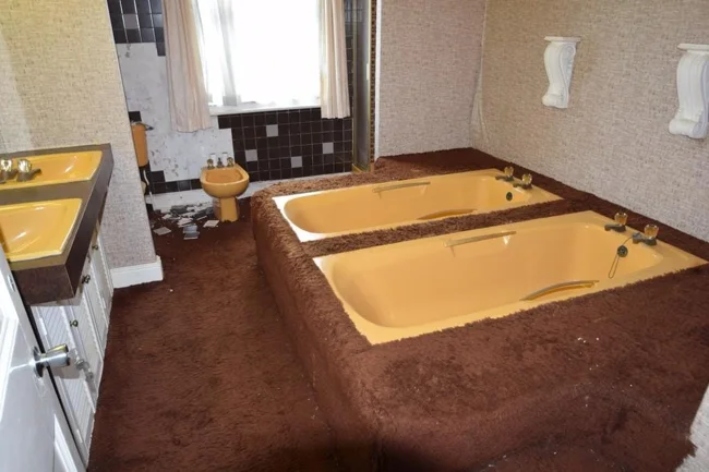
They say this carpet used to be white.
The sink is close enough that you can wash your hands while you do your business 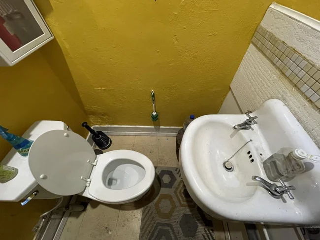
It's convenient, isn't it.
Okay, now we have to figure out which direction the regular men's restroom is. A mystery, a mystery... 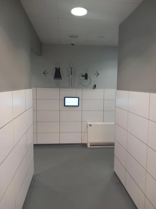
A complex, but extremely useless design. Yes, yes, it's a sink 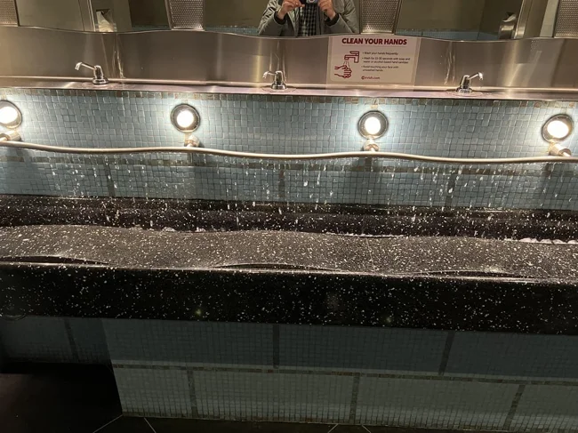
It's a pipe with holes, so if one person uses it, the water is spent on 5 people. I wonder what the designer was guided by when creating this miracle.


