17 examples of design that can hardly be considered exemplary (18 photos)
Any thing made for practical use must be aesthetic and comfortable, and its design should be logical. It seemed would, it's obvious! Alas, not for everyone. 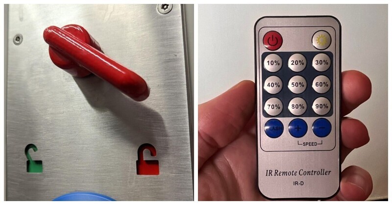
1. "A bunch of buttons to control the brightness, but you can't bring the brightness to 100%" 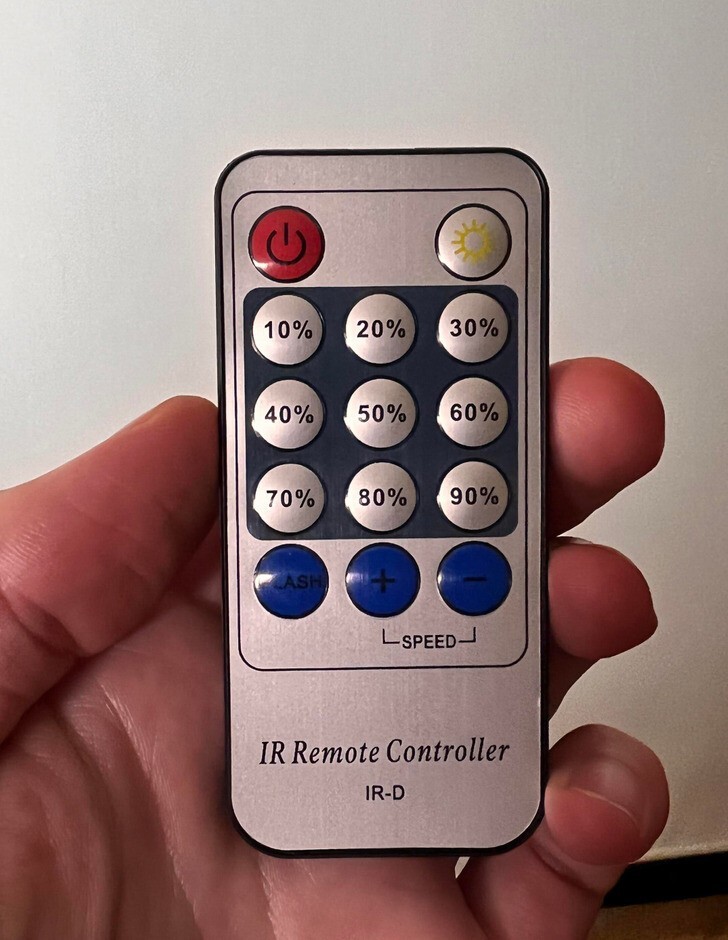
2. "Children's attraction. Spider-man, whose panty line is visible" 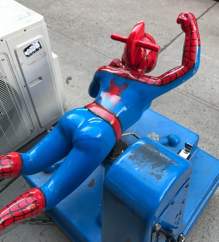
3. "Student housing not intended for human habitation" 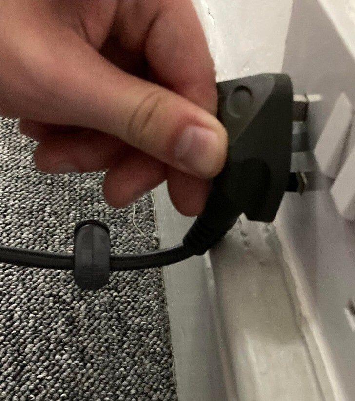
4. "The lock symbol for some reason looks like an open lock, although logically it should be closed" 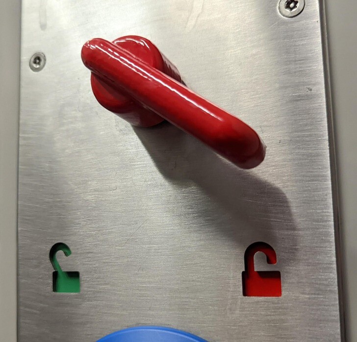
5. Toilet in the form of Donald Duck 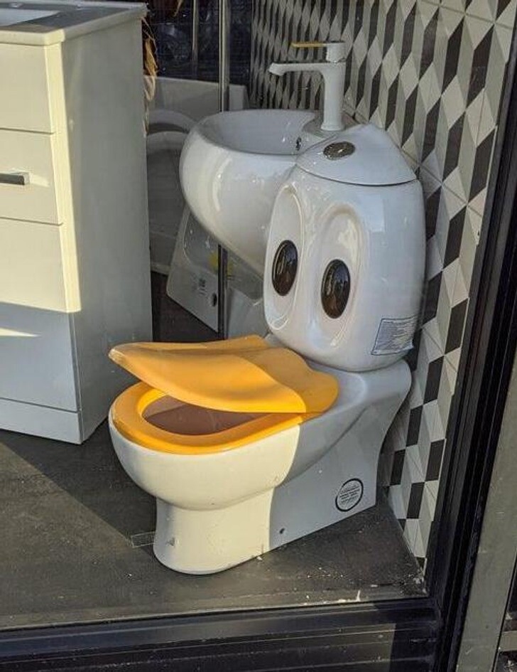
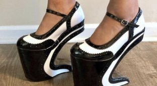
6. "For those who love to zigzag?" 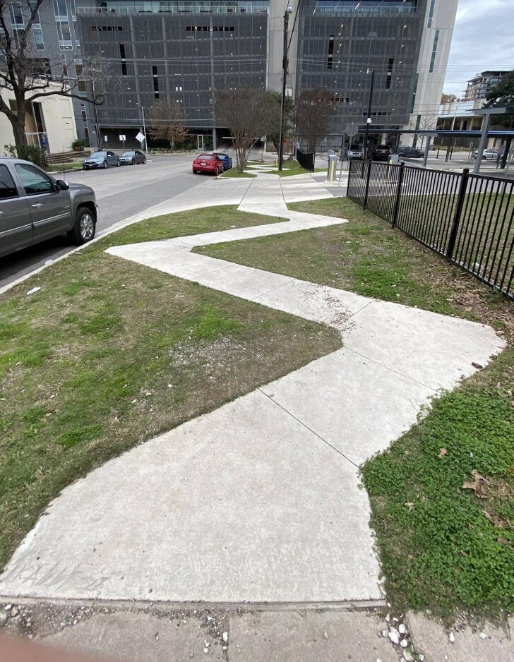
7. "The longer I look at this house, the more asymmetry I find in it" 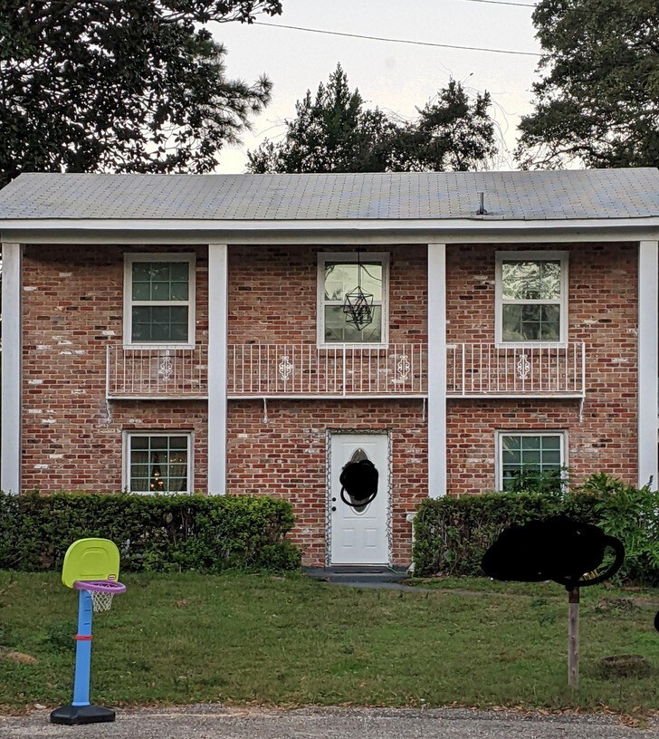
8. "I've been trying to figure out what this sign means for five years." 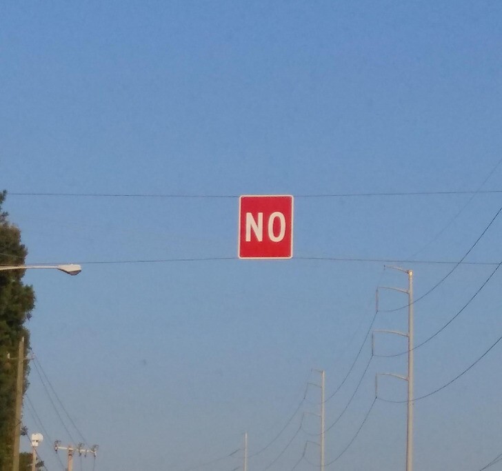
9. "Closed" is written here, and "Come in" right next. What kind of nonsense? 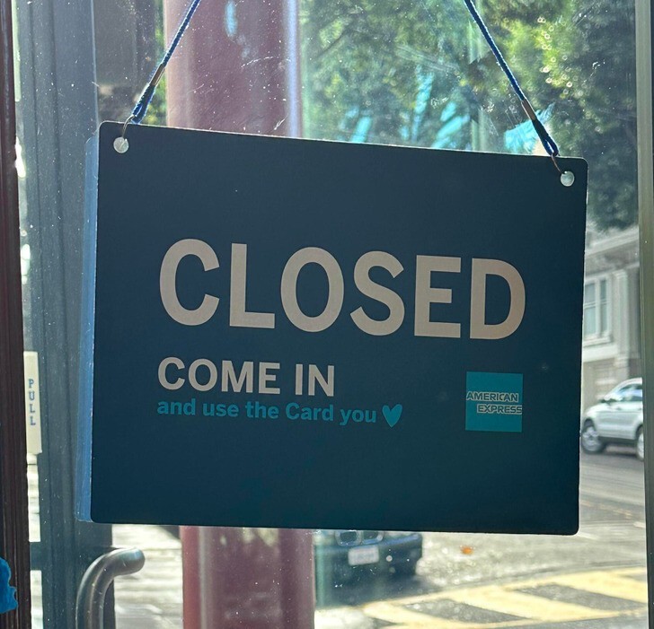
10. "It's NOT a unicorn" 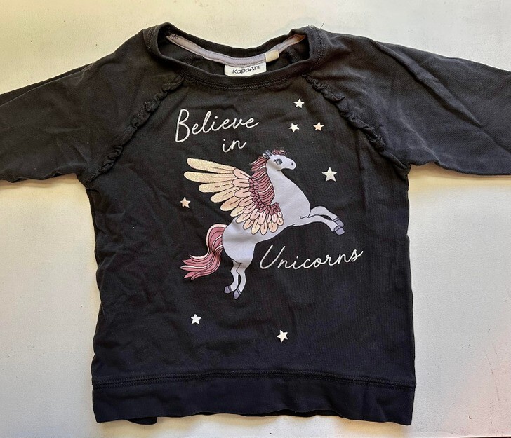
11. "I'm on the bus. Here they serve coffee in an "environmentally friendly clean "glasses. Apparently, they leak, so they are inserted into plastic. What irony!" 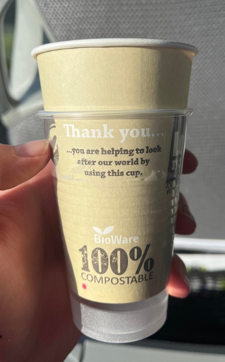
12. "Someone likes the daily risk" 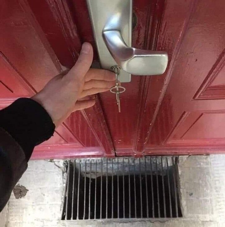
13. "Plastic shiny parts on the steering wheel reflect sunlight directly into my eyes while driving" 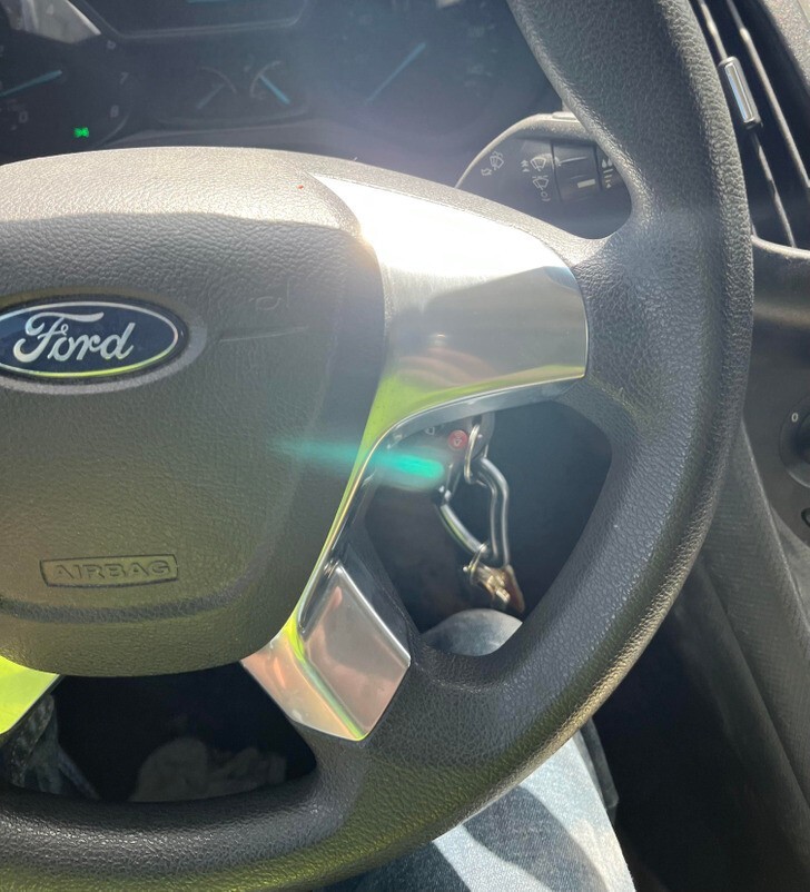
14. "Thought this hoop from our store was broken until I bought another one. Turns out it's the design." 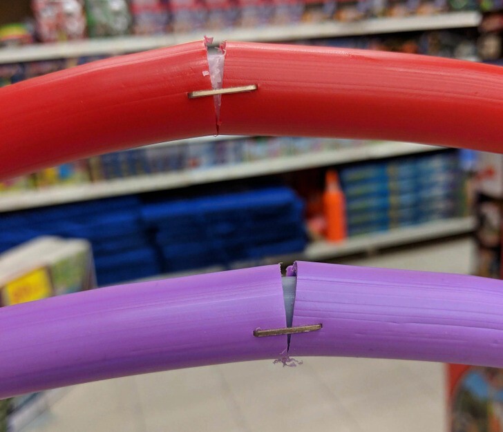
15. "This is some kind of drink, I saw it in the store. The packaging designer did his best." 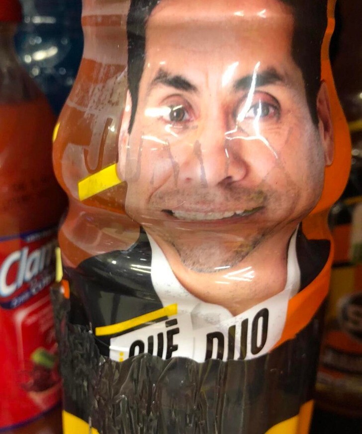
16. "The model on the packaging of socks is shown without socks" 
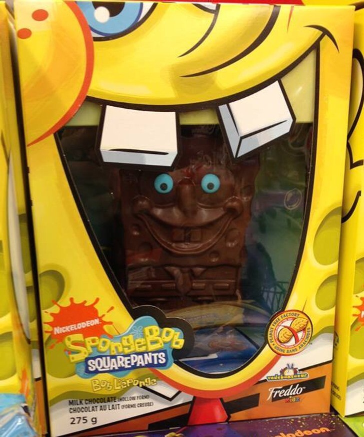
17. Chocolate SpongeBob, heartbreaking sight 