Advertising campaigns that remain in memory forever (23 photos + 2 videos)
Without advertising, no business exists. In the modern world, with the presence of all kinds of technologies, it has become something akin to art - it can shock and delight. Or make you laugh. Or even destroy. 
But the art of advertising goes back to antiquity, when sacred symbols were created, making it clear how one cult differs from another. In the United States, advertising reached its peak in the late 19th and early 20th centuries. Large manufacturers dreamed of entering the world market and remaining “in the minds” of potential consumers. In Europe, this process took place a little earlier and the industry was more stable and calmer.
Here are examples of advertisements that revolutionized the advertising business.
The Coca-Cola Company – Coca-Cola drink (1931) 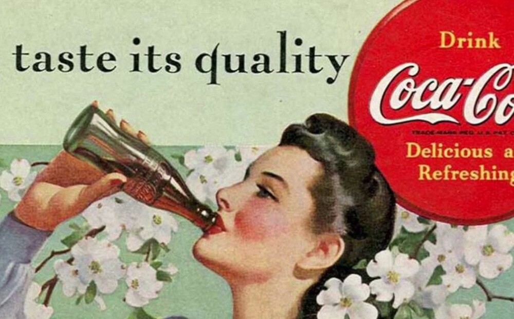
As you know, the world famous drink was invented by pharmacist John Pemberton. And the name itself and the first logo were created by his friend Frank Robinson.
Coca Cola was first advertised as a regular refreshing drink and the images in the advertising were very standard - people relaxing while having a pleasant conversation, drinking soda.
The Coca-Cola Company initially wanted to present their product as a soda for a variety of people - of any gender, age, social status and profession. After some time, it became clear that sales skyrocketed in the summer and tapered off in the winter. This means it was necessary to stimulate buyers to need Coca Cola in winter. Who else but Santa Claus is the main symbol of New Year and Christmas in the USA? 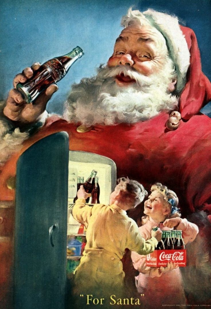
At that time, people had a very rough idea of the image of Santa: something between an elf, a church minister and a gnome. So-so advertising object, would you agree?
The same Santa who became famous throughout the world was painted by Headon Sandbem, a Chicago artist. A plump and kind old man, with a thick beard, dressed in a red suit and cap. Such caps are still a must-have attribute of any New Year's party.
In the advertisement, Santa Claus rode with reindeer, jumped down chimneys, checked whether the children were obedient, and all this in the company of invigorating Coca Cola.
Headon Sandbam managed to portray soda so deliciously that it has become one of the most recognizable drinks in the whole world. It's funny that Sandbam himself didn't really like her. 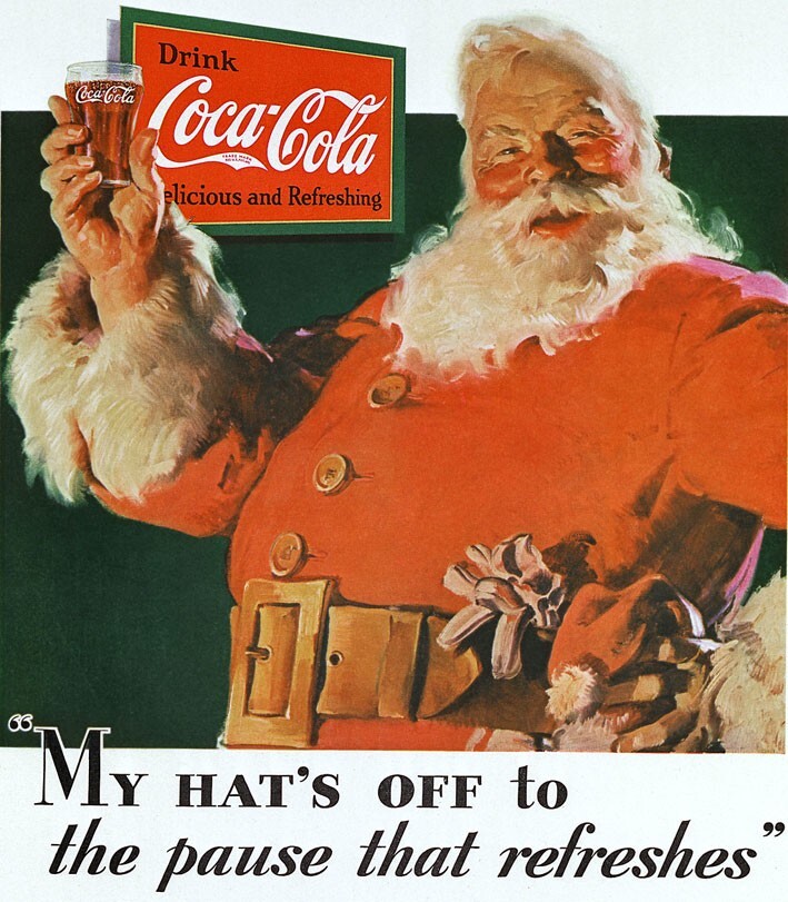
This campaign has become a real legend in the world of advertising business, because to this day Coca Cola is associated with a sweet and good-natured old man, cozily grumbling “ho-ho-ho.”
National Biscuit Co. – Uneeda cookies (1899) 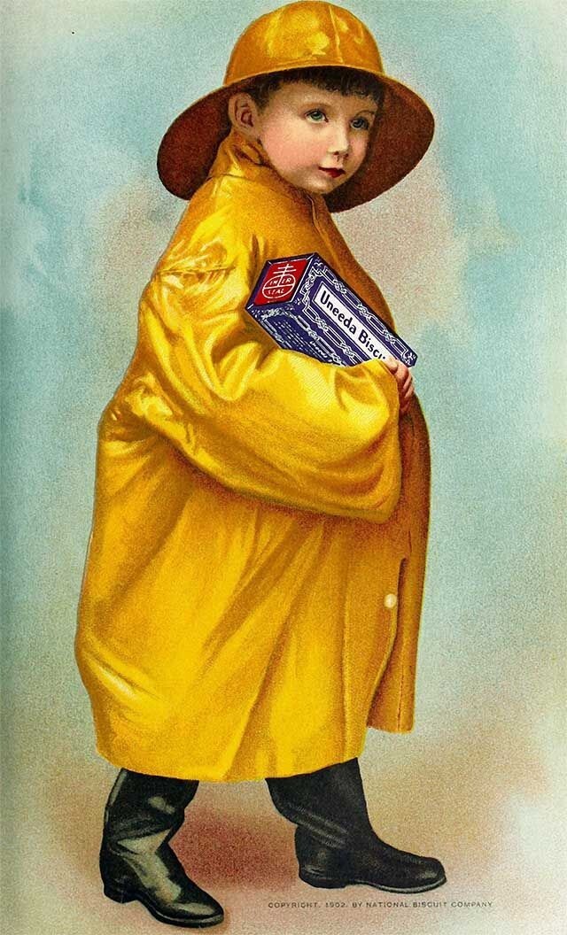
It truly revolutionized the grocery industry - consumers finally got what no food manufacturer could give them before.
Advertising agency NW Ayer And Son took the biscuit company National Biscuit Co under their patronage and created advertising that is still included in the list of the best campaigns in the world. 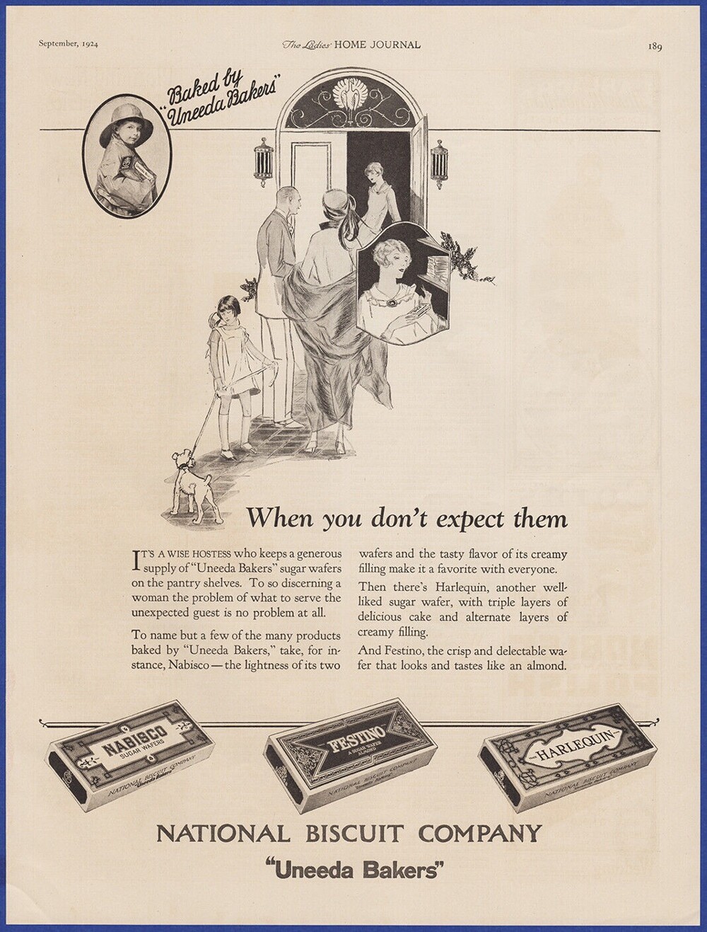
From what was before, only the recipe for delicious cookies has been preserved, and everything else has undergone dramatic changes. In the name of the cookie, advertisers decided to play with words: the name "Uneeda" is a combination of the words "You need a" "You need." The slogan of the new product immediately appeared: “So that you don’t forget, we will say it again Uneeda biscuits.” The unique packaging in the form of a durable cardboard box became its distinctive feature, distinguishing it from the mass of other confectionery products sold by weight. Thanks to this innovation, the cookies retained their uniqueness and integrity.
Buyers were attracted not only by the packaging and ease of carrying, but also by the opportunity to quickly read information about the composition and expiration date right on the box. 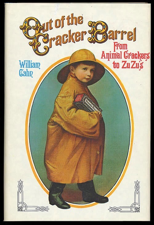
But perhaps the most striking event was the advertising campaign starring the Uneeda boy. This mischievous and charming kid carrying a huge box of cookies on the posters instantly became a symbol of the brand. Uneeda broke into the advertising world so decisively that its campaign budget became the first in history to reach $1 million.
Levi's - Model No. 501 (1984)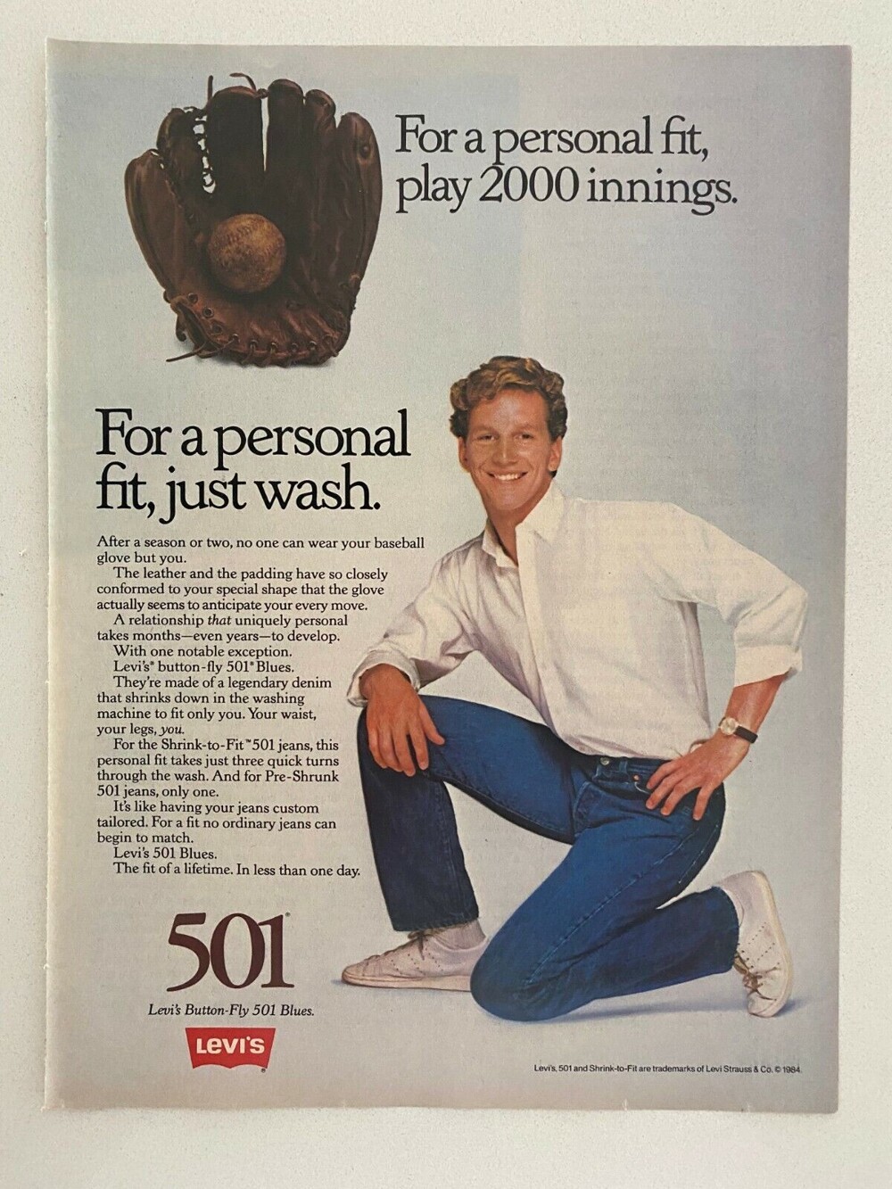
It was in the 80s that fashion houses began to openly display their logos on clothes.
And Levi’s did a great job advertising the 501 jeans, following the “lots of brand” trend.
White inscription on a red background became the basis of all commercials, and advertisers fantasized about the plots as best they could. Either the logo ended up in the land of the elves, or in the jungle, but the ending was always the same - the logo turned into lips pronouncing “Levi’s”. 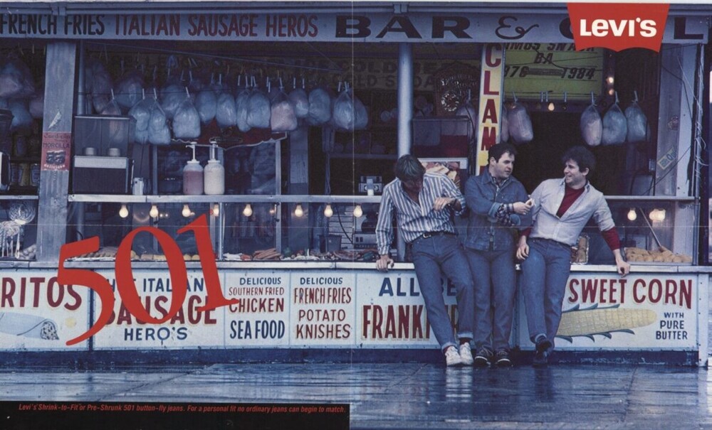
Of course, such a bold campaign was more aimed at a young audience. Jeans in those days were still clothing for young people. In one of the videos, the logo even talked to teenagers in the park. Animated advertising in those years was very unusual, attracted attention and was memorable.
Andrew Jergens Company - Woodbury Soap (1911) 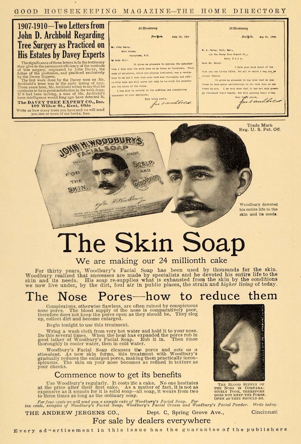
In the second half of the 19th century (from the 70s), dermatologist John Woodbury began making soap. But there was one problem: the man had little understanding of the importance of design and decoration. Well, or I didn’t consider it such an important sales factor.
Woodbury decided to simply put his own portrait on the packaging. This was not a good decision by any advertising rule, but this is what made Woodbury Soap stand out from its competitors. After all, previously only factory logos were placed on hygiene products.
After some time, Woodbury Soap was bought by Andrew Jergens Company and did not change either the name or design. For a while they sold the soap as is, but they had to admit that change was necessary. The soap was practically not sold and the point was not in its quality, but in the lack of a good advertising campaign. 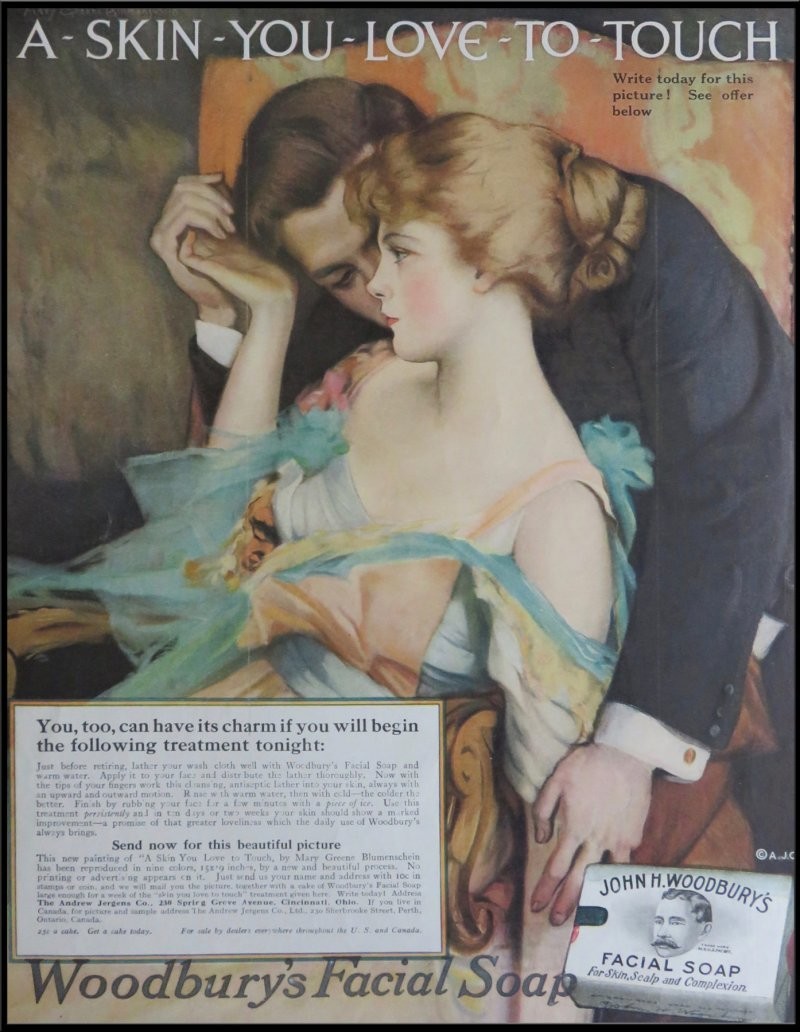
Helen Resor, one of the most successful American advertisers of that time, took up the matter. Helen knew well what was important and valuable for girls.
The portrait of John Woodbury was replaced with a stylish and delicate design that matches the concept of the product. Rezor understood that she could force women to buy just such soap - the promise to make them beautiful and desirable. The new packaging depicted a woman being tenderly kissed on the neck by an elegant gentleman.
“This skin you want to touch” became the slogan of Woodbury Soap.
There was more than one poster like this, but they all had the same concept - soap will make a woman’s skin soft, velvety and attractive. The price was affordable for everyone. 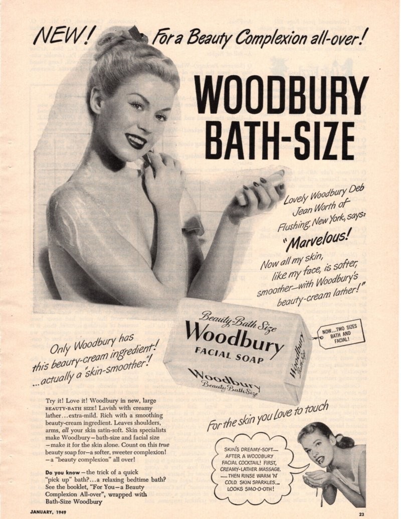
Helen decided to go further and added information on how to better care for her skin on advertising posters. And if a woman presents a special advertising booklet when purchasing, she will receive a trial sample of soap for free.
Needless to say, soap sales went up sharply.
The Woodbury Soap ad was the first ad to use femininity and attractiveness so well. And, by the way, it was precisely at the instigation of Helen Rezor that the production of various hygiene products only for women began to actively develop. Unfortunately, this later led to a tax on pink, but as an advertising campaign it was a breakthrough.
American Tobacco Company – Lucky Strike cigarettes (1920) 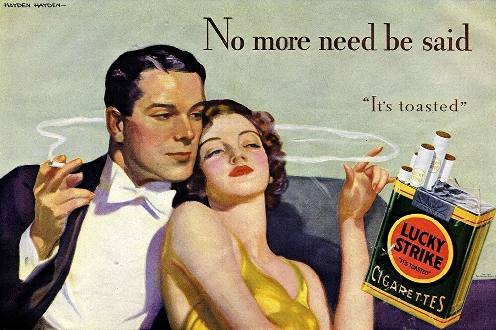
Disclaimer: smoking is harmful to health, this is not about promoting smoking, but about advertising.
The USA in the 20s of the last century was famous for its prohibitions. Especially in relation to women. Everything was declared: what and how to wear, where to go to work (or better yet not to go), low salaries, manners, behavior in society, how one “should” look (volume parameters), the right to control one’s own body, etc. The active fight against discrimination, in fact, was just beginning, but for now, society condemned almost any departure from the “rules.” Of course, this also applied to smoking. 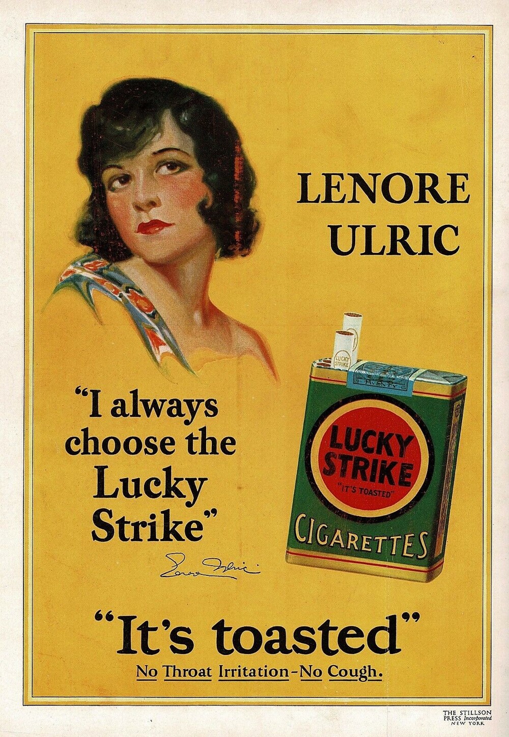
The creation of the Lucky Strike advertisement began with the fact that a nutritionist prescribed smoking to the wife of the head of one of the US advertising agencies (Albert Lasker). Well, yes, there are a lot of questions for a nutritionist, and first of all about his qualifications.
And then one day a woman decided to smoke in a restaurant, receiving a lot of disgusted looks in response. The husband, of course, was dissatisfied with this state of affairs and decided that he would soon force everyone to accept the fact that a woman could just as easily smoke wherever she wanted. Including this very restaurant. The task was quite puzzling, because it was necessary to change the attitude towards smoking in the entire country. But Lasker got down to business seriously and soon notes began to appear in all media about how beneficial it was to inhale tobacco. 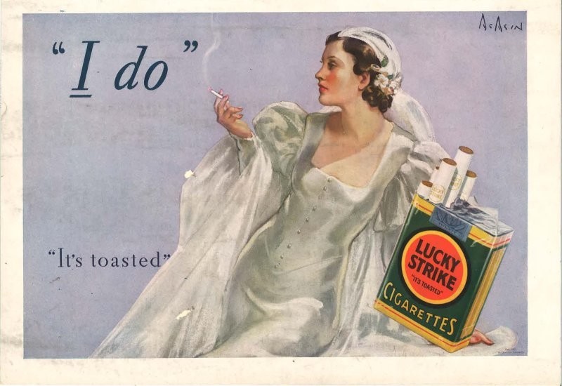
It was a complete profanation: tobacco supposedly had absolutely magical properties. It improves health and reduces weight (and this has always been strictly monitored).
The slogan of Lucky Strike was the idea “Combine business with pleasure.”
Further more. They began to contrast cigarettes with various delicacies. The idea belonged to the copywriter of the Lasker agency, which he took directly from life when he saw two women on the street: one of them was quite plump and was eating some kind of candy, and her friend was thin and smoking a cigarette. The copywriter came up with the slogan “Take a cigarette instead of candy,” which became an ideal continuation of the Lucky Strike concept of losing weight with cigarettes. 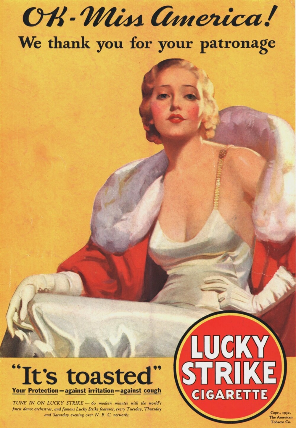
Lasker also attracted slender celebrities to the campaign; on the posters they held, in an elegantly outstretched hand, a smoking Lucky Strike.
After some time, the authorities banned writing lies about the benefits of tobacco products, but Laskert achieved his goal - he changed the attitude towards smoking among almost the entire population of the country. The fashion for the cigarette diet has passed, but the habit remains.
Wrigley Company – Doublemint chewing gum (1950s) 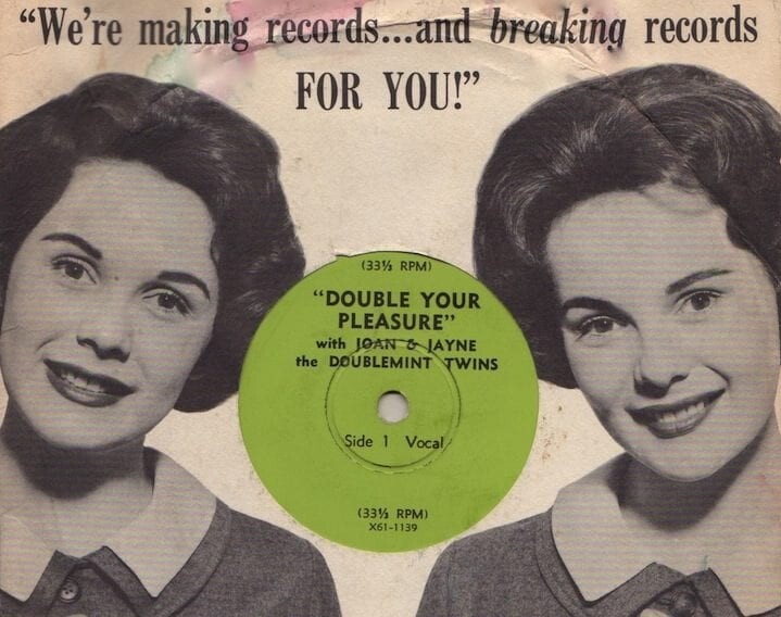
The Wrigley Company has been known since 1914 - they made mint chewing gum. When the company's owners decided to make the product even more minty, Doublemint was born. Advertisers took this “double mint” as a basis to promote their product. 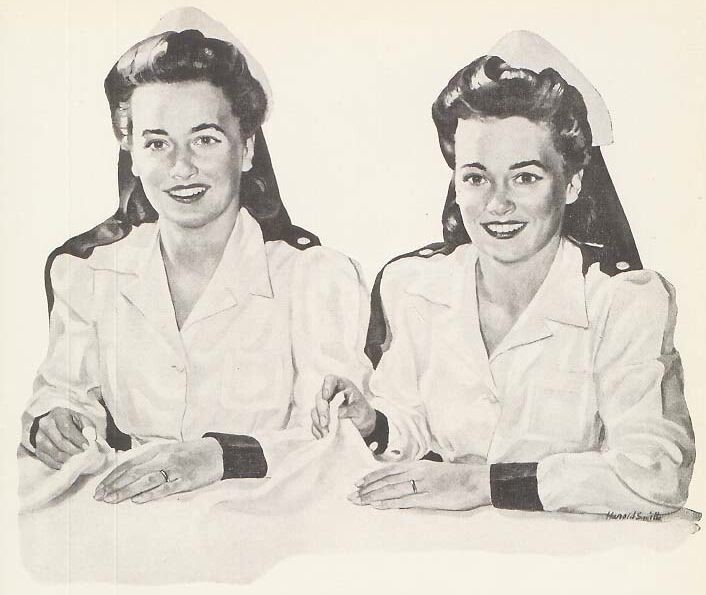
This is where the twins Jane and Joan Boyd appeared, who remained in memory for a long time as the “double mint twins.” The sisters played in 12 videos, where they had a great time - riding bicycles, skating, playing sports and were always in a good mood.
After they stopped working with the Wrigley Company, the famous sisters began to be replaced by other twins. At first they were selected to be similar to Boyd's type, but then any twins began to appear in advertising - boys, girls, even animals. 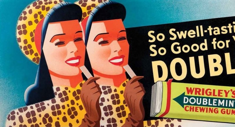
The slogan “Double your pleasure with Doublemint chewing gum” has truly gone down in the history of the advertising world.
Mars LLC - M&M's jelly beans (1954) 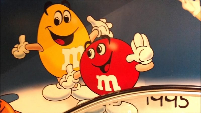
Mars LLC was a successful chocolate candy company by 1954. Sales were consistently high and there was no need to do anything to urgently save finances.
But when chocolate-coated peanuts were put into production, a new advertising campaign had to be launched.
The slogan was created by advertising specialist Rosser Reeves. This guy became one of the first in the practice and theory of the advertising business. The slogan “Melts in your mouth, not in your hands” is truly brilliant. Reeves developed an excellent selling proposition for M&M's, and the main selling point of the candies was their ability to not melt in hot weather.
But there was also a downside to such a loud statement - people decided to check whether the candies were as heat-resistant as Mars LLC claims. It turned out that they are exactly the same as other candies with the same composition. But advertising has already become so firmly ingrained in the brains of buyers that whether they melt or not melt is all the same.
Rosser Reeves' unique offering strategy has often been criticized. After all, in fact, it is difficult to find unique qualities in a product that are different from similar ones. But in recent years, technology and science have been rapidly developing, so the fashion for the uniqueness of the most ordinary goods is returning again. But biting slogans may not be enough to describe all the qualities.
One way or another, a unique strategy is the foundation of the theory and practice of advertising, and the M&M’s campaign is a classic example of it.
Philip Morris – Marlboro cigarettes (1955)
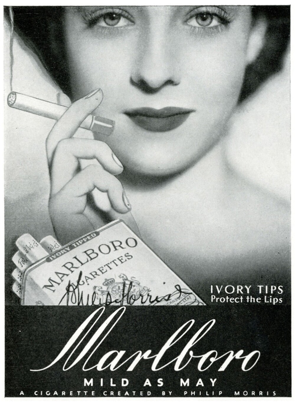
Disclaimer: smoking is harmful to health, this is not about promoting smoking, but about advertising.
Interestingly, Marlboro was a product only for women until the mid-20th century. Of course, men could also smoke them, but they were not aimed exclusively at a female audience: the packaging was decorated with a delicate and beautiful font, and the slogans described them as “soft.” The filter was pink so that lipstick marks would not be visible.
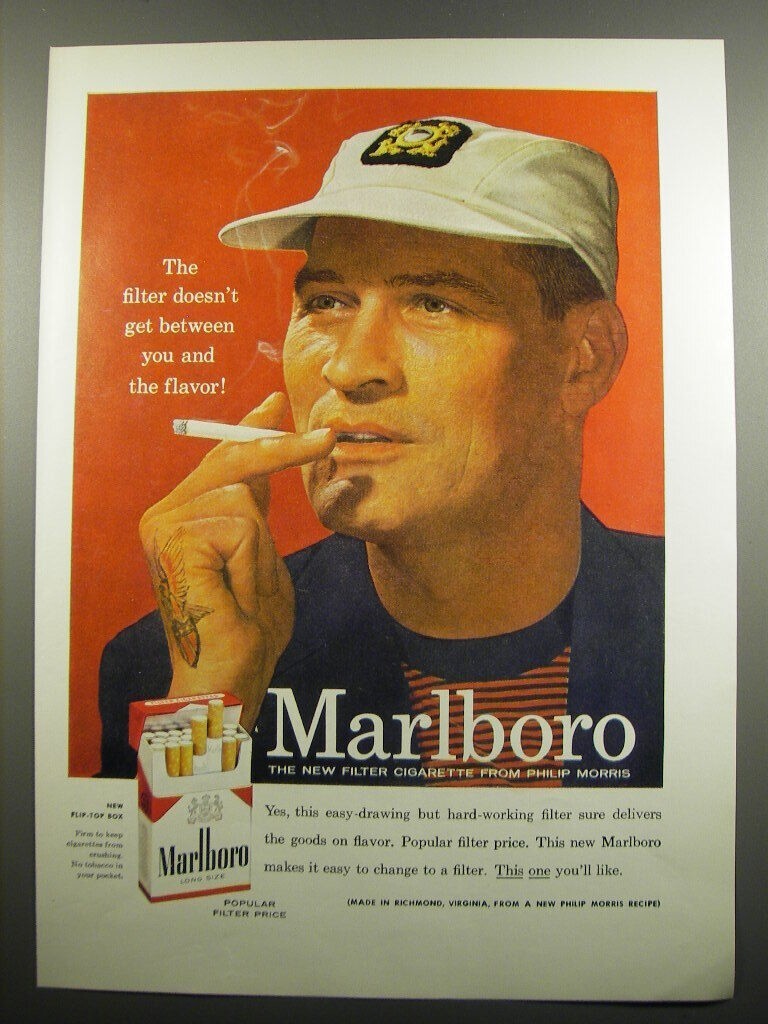
But despite these “temptations,” Marlboro could not surpass the success of Lucky Strike among women. And so it was decided to completely change the concept of the product - from “women’s” cigarettes, they were supposed to turn into brutal men’s ones.
The first thing to change was the design of the cigarette pack. Designer Frank Gianinoto designed the pack in three colors - black, red and white, and the pink filter was decisively rejected. Well, the new hard pack was easy and convenient to open.
All over America, posters began to appear in which stern military men, sailors and pilots stood with their sleeves rolled up, showing a Philip Morris tattoo on their arm. Unfortunately, the advertisers made a mistake here. They thought that a tattoo would be associated with masculinity, but this was long before the advent of tattoos to ordinary people. In those days they were associated only with criminals. And the same tattoo was more reminiscent of adherence to a cult.
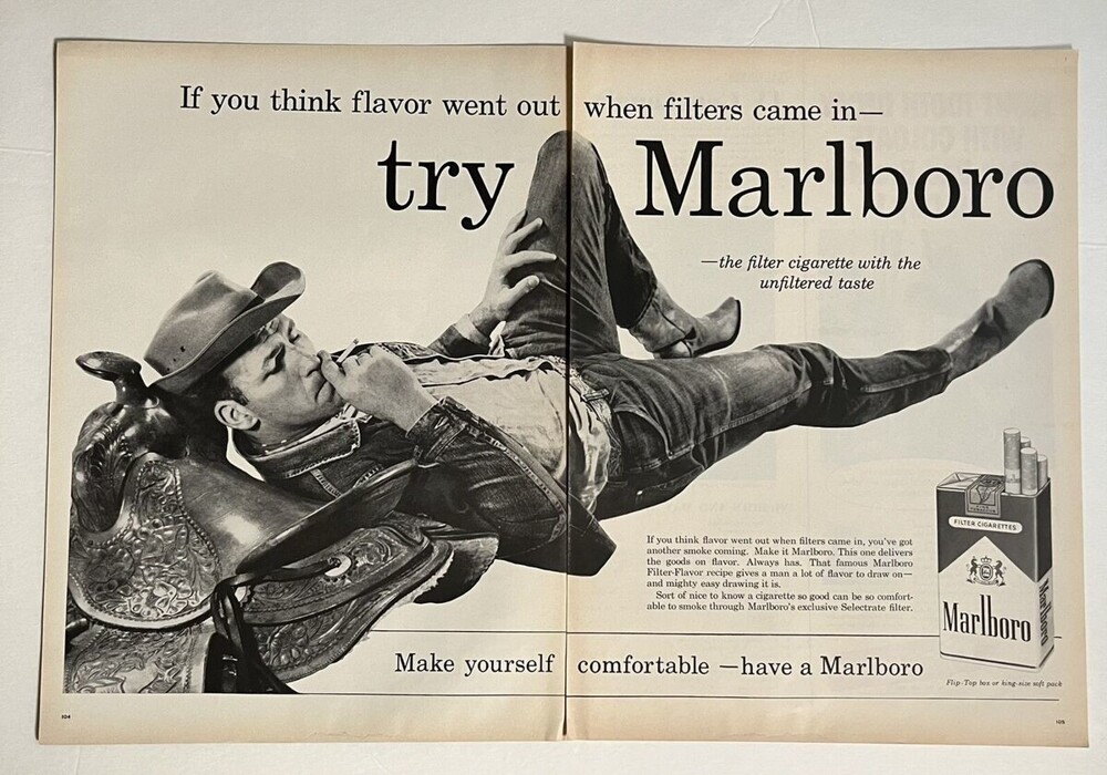
The strategy didn’t work and Philip Morris decided to hire the advertising agency Leo Burnett. They immediately got actively involved in the work - they took a cowboy as the main character. He was courageous, confident, and firm in his position. It was right on target! The cowboy was not only something of a national symbol of the United States. For residents of other countries, a cowboy has become something new and unusual.
As soon as the campaign began, Marlboro sales skyrocketed and within a month they became true market leaders. The Marlboro cowboy busily went through all the competitors and still remains the first association with these cigarettes.


