Sometimes it seems like some designers hate humanity. How else can you explain bread packaging that looks rotten, or the stairs in a psychologist's office that could leave you with all your teeth? Let's look at examples of design madness: from mysterious signs in Malaysia to wheelchair "traps" and reflective menus that are impossible to read.
Bread packaging that looks like mold 
The menu is only accessible via reflective QR code. 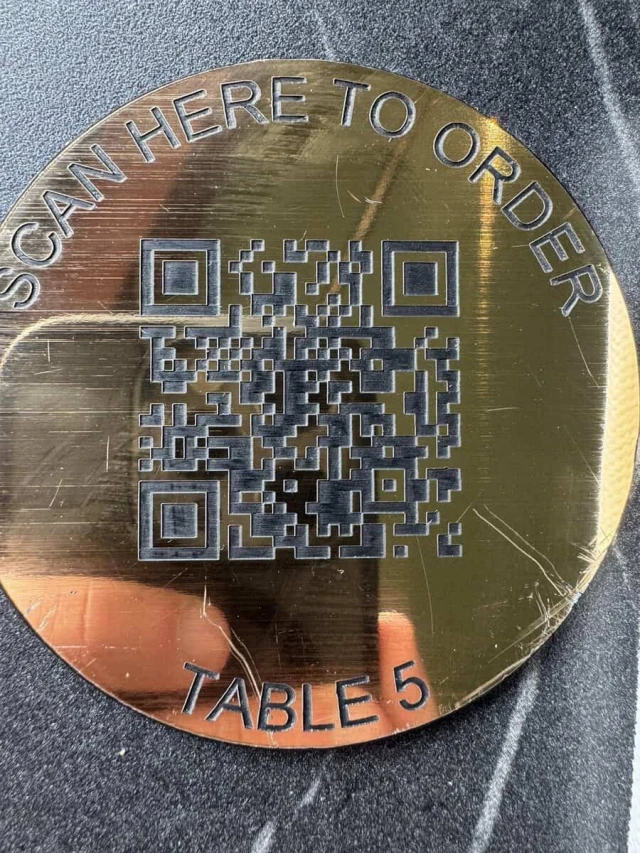
What exactly do you think this sign prohibits? 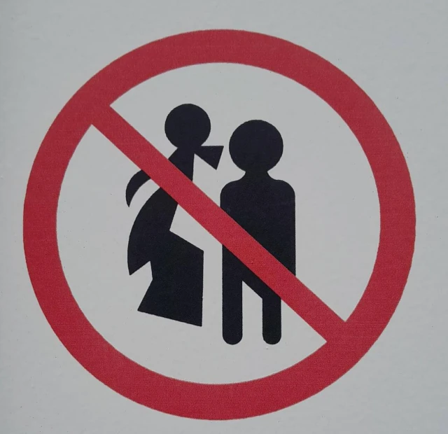
Correct answer: no public displays of affection. This sign can be found in Malaysia.
The magnet doesn't work because it's bent. 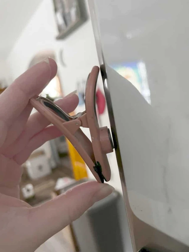
The seat numbers are located exactly in the middle between the seats. 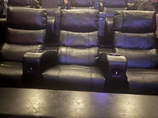
Another section: Guess what the instructions mean. 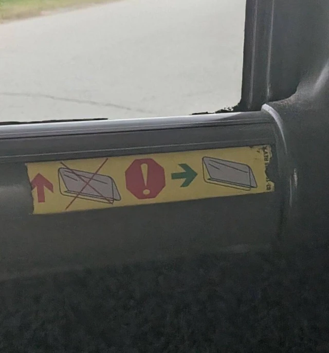
Creepy logo Dentist 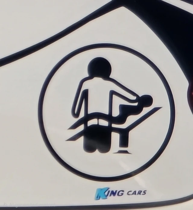
All the streetlights look like this. It hasn't rained for a week. 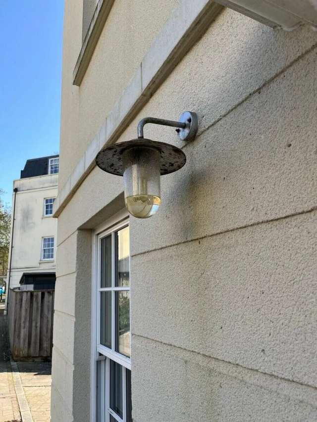
Combo: uneven surface, steep slope, and blocked access. All this is for wheelchair users. 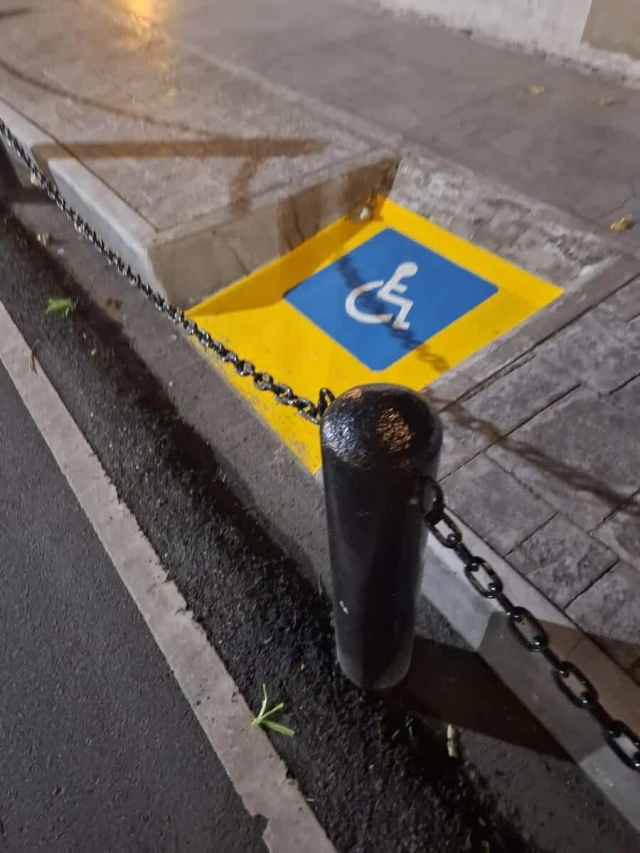
You open the door and... IMMEDIATELY THERE ARE STEPS. 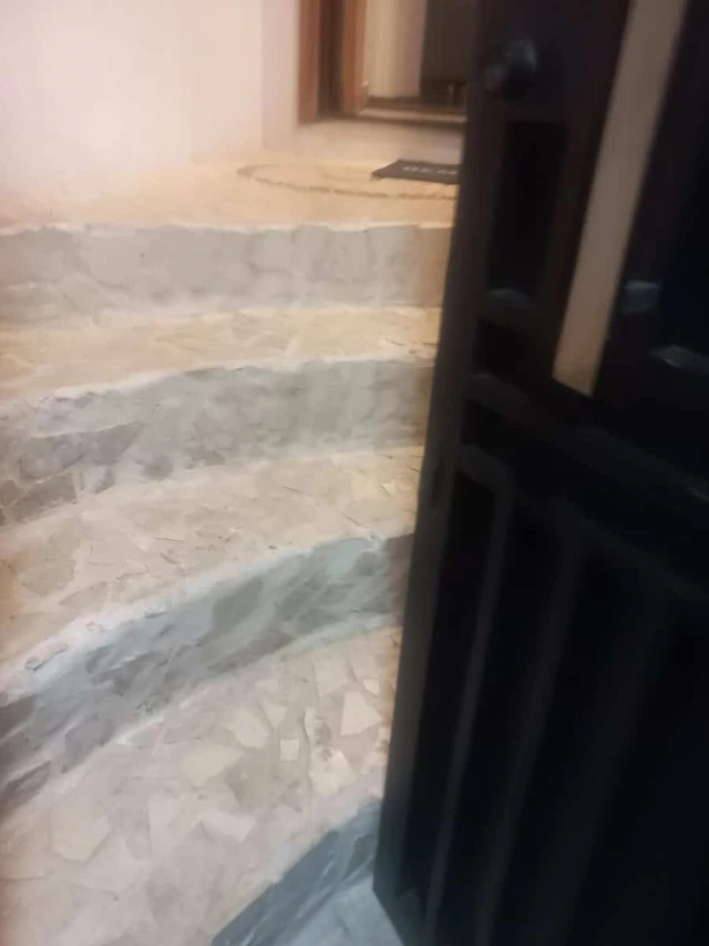
Continuing with the series: what can't you do on a plane anymore? 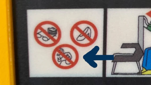
A classic. Caring for people in wheelchairs 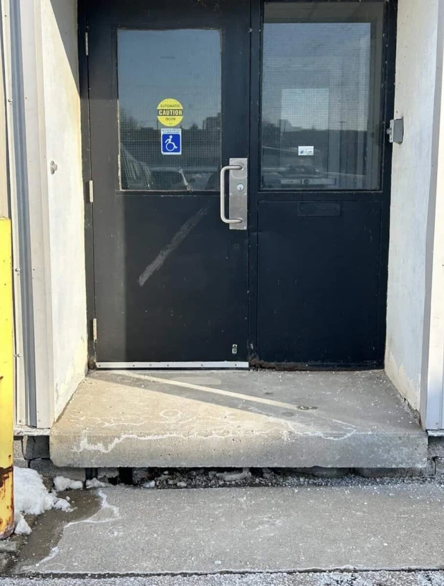
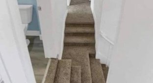
Stair design in the genre: what could go wrong? 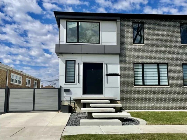
Add your comment
You might be interested in:


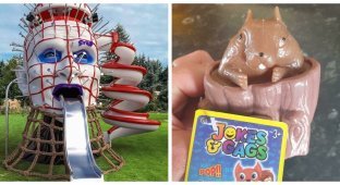

Why Kinder Surprise is banned in the US

Height, a Short Rope, and Nerves of Steel

When Technique Fails, But Sense of Humor Doesn't

Mexican Metal

A Man Made a Durin Door with Glowing Runes

The owner of the house wrapped thieves in duct tape from

Acrobatic wonders. In the kitchen

Clicks Releases Its "Anti-Smartphone"

Instead of a Car, an Agrodrone: A Farmer Showed His Daily