Suzuki unveiled an updated logo that hasn't changed in over 20 years (4 photos)
Suzuki Brand Update
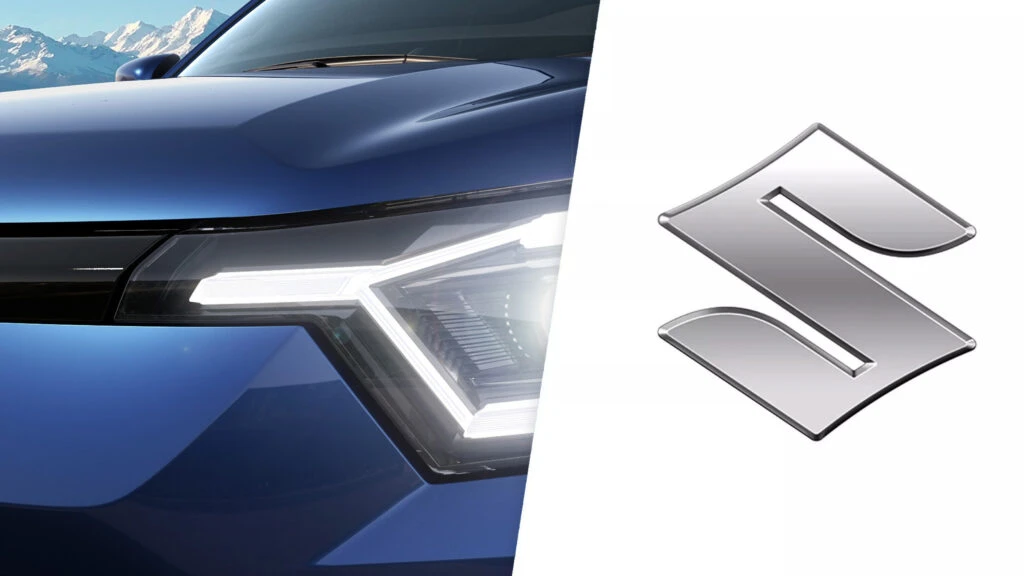
Suzuki has unveiled its first logo redesign in twenty years. The new emblem has a flat, chrome-free look that is in line with modern trends. The updated sign retains the characteristic silhouette of the letter “S”, which has remained virtually unchanged since 1958, but now has a smooth surface with thin contours.
Modern branding challenges
In the era of smartphones and social networks, brands are increasingly abandoning voluminous 3D logos in favor of simplified two-dimensional versions. Design experts explain that such logos look better on mobile screens, where the main interaction with customers takes place.
However, critics believe that simplifying the symbols deprives them of the depth and physical presence that they had in the real world. Suzuki has become another manufacturer to join this trend - Volkswagen, Audi, Nissan, Mazda, BMW and many other automakers have previously made similar changes. 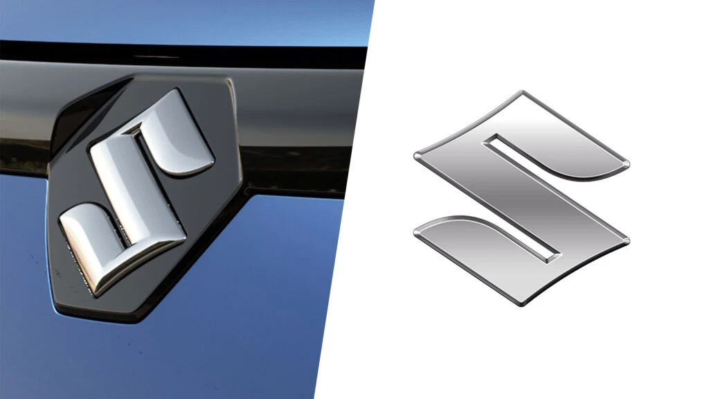
Presentation and implementation
The company confirmed that the updated logo is part of a larger brand update under the slogan “By Your Side”. The new emblem will be first seen on concept cars that will be presented at the Japan Mobility Show 2025 on October 30.
The new logo will be gradually introduced across Suzuki's global lineup. Since the proportions of the emblem have remained unchanged, it can be easily installed on the grilles and rear doors of existing models without waiting for a refresh cycle. The latest model in Suzuki's portfolio is the Victoris SUV, introduced for the Indian market. 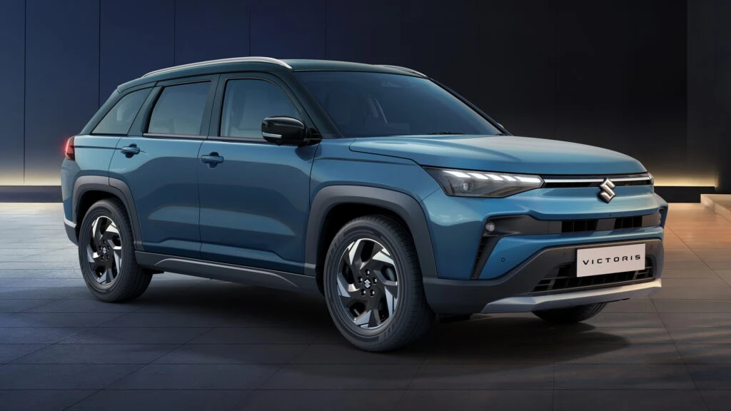
Suzuki President and CEO Toshihiro Suzuki explained the motivation for the brand update: “The new emblem embodies Suzuki’s commitment to ‘putting ourselves in the customer’s shoes to create valuable products’, which has always been a core value, as well as our determination to take on new challenges in the coming era. Under the corporate slogan ‘By Your Side’, we will continue to provide infrastructure mobility that is closely linked to everyday life, moving forward together with our customers and contributing to the realization of a sustainable future.” 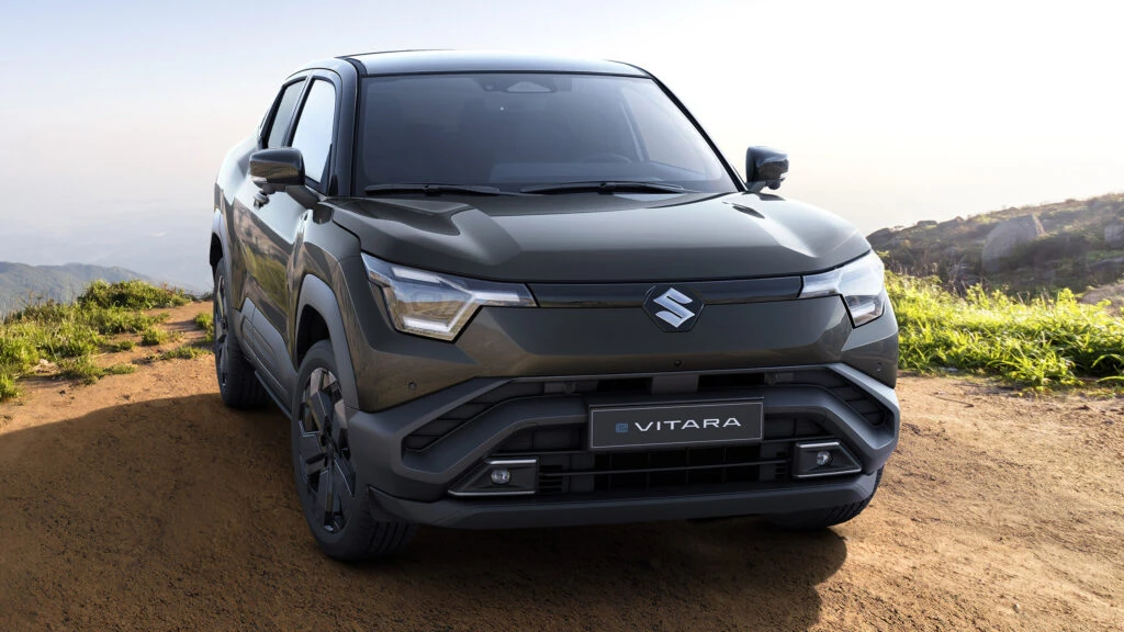
The move to flat logos has become a global phenomenon in the automotive industry, reflecting a shift in the way society perceives brands. This trend demonstrates how digital technologies are influencing even such traditional aspects as corporate symbols. For Suzuki, which has a rich history, this update symbolizes a willingness to adapt to new conditions while maintaining its identity. It is important to note that the logo change is accompanied by an update to the entire line of vehicles, which indicates a comprehensive approach to brand modernization.