“Beautiful, but why?”: 30 examples of problematic design (31 photos)
Some things, furniture, interior items and design solutions look beautiful - but at the same time they do not provide any functionality, even require a lot of time to clean, or are generally useless. Netizens shared examples of such things that they encountered in different places. 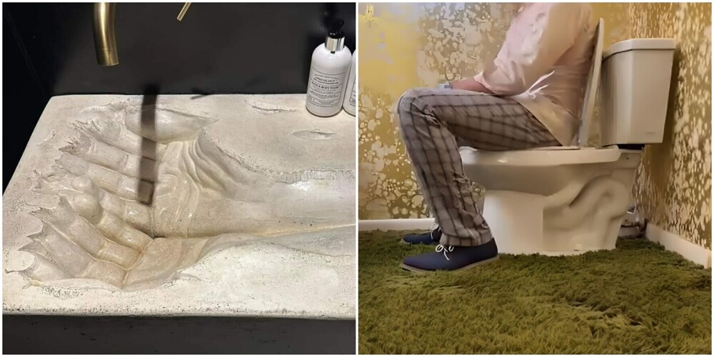
1. Beautiful, of course - but it takes a long time to clean it all 
2. Fluffy carpet in the bathroom is a so-so idea. 
3. “That sink at my parents’ house always pisses me off.” 
4. Carpet on the walls in the airport toilet. Hawaii 
5. Dust will accumulate there.. 
6. “I will never understand why they make such faucets..” 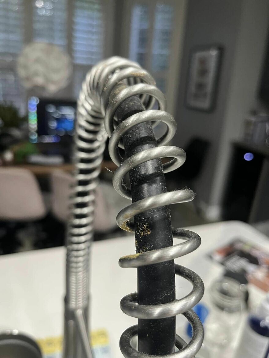
7. Sink in a hotel toilet 
8. "I don't even know where to start here.." 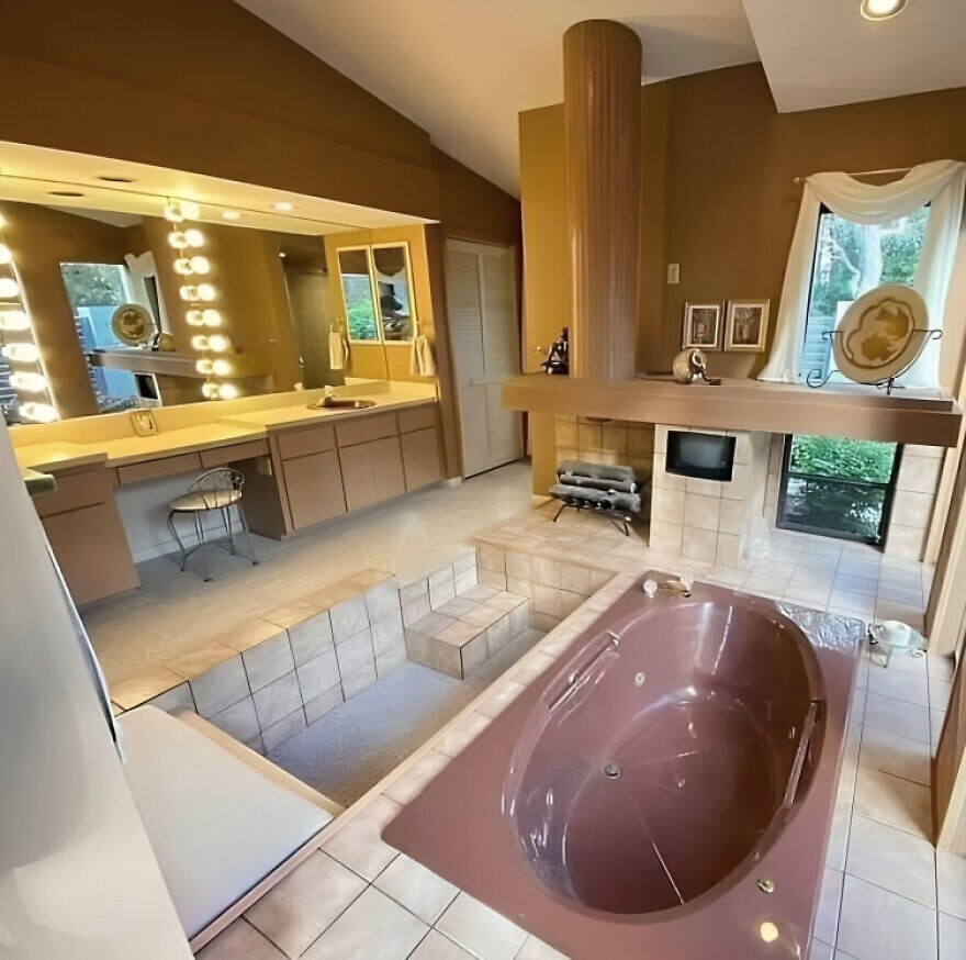
9. Fabric inserts on the temples of glasses.. Not very hygienic 
10. Furry wall in the hotel 
11. This will also be difficult to clean. 
12. Every speck of dust is always visible on black. 
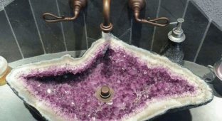
13. Carved limestone sink 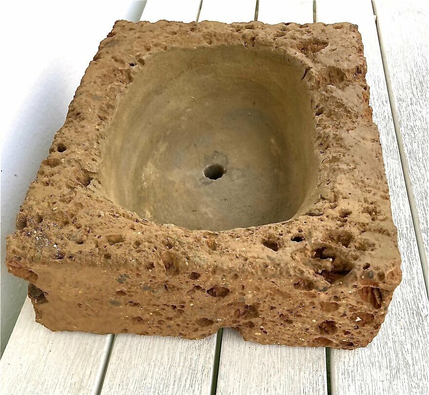
14. This will also be extremely difficult to clean. 
17. “I saw this in a public toilet and immediately imagined how many germs accumulate there.” 
16. Ceiling in a restaurant 
17. Of all the possible restroom designs in a restaurant, they chose this one. 
18. Looks cool, but not exactly hygienic 
19. Chandeliers in the restaurant. They look like they can't be cleaned at all. 
20. Floor in the shower of a hotel room.. 
21. Phone case 
22. The most useless recess behind the stove, which only collects dirt 
23. And again the tree on the sink 
24. I guess some people just like to clean. 
25. Endless stones 
26. “This was supposed to be a stylish addition to the restroom, but it just ends up collecting dust..” 
27. The frame of this mirror is also impossible to clean. 
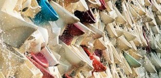
28. Memorytnik with plastic bowls in Rome that no one is going to clean 
29. Wall made of "stumps" 
30. Shower in a rented house 
