20 vile packages that Satan himself could not have come up with, but marketers could (23 photos)
Some of the packages are so dastardly designed that even the Satan could not have created them. But marketers could and how! 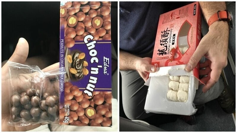
In this post you will find such vivid examples of corporate greed that you may well need a fire extinguisher for a burning fifth point.
This is what evil looks like 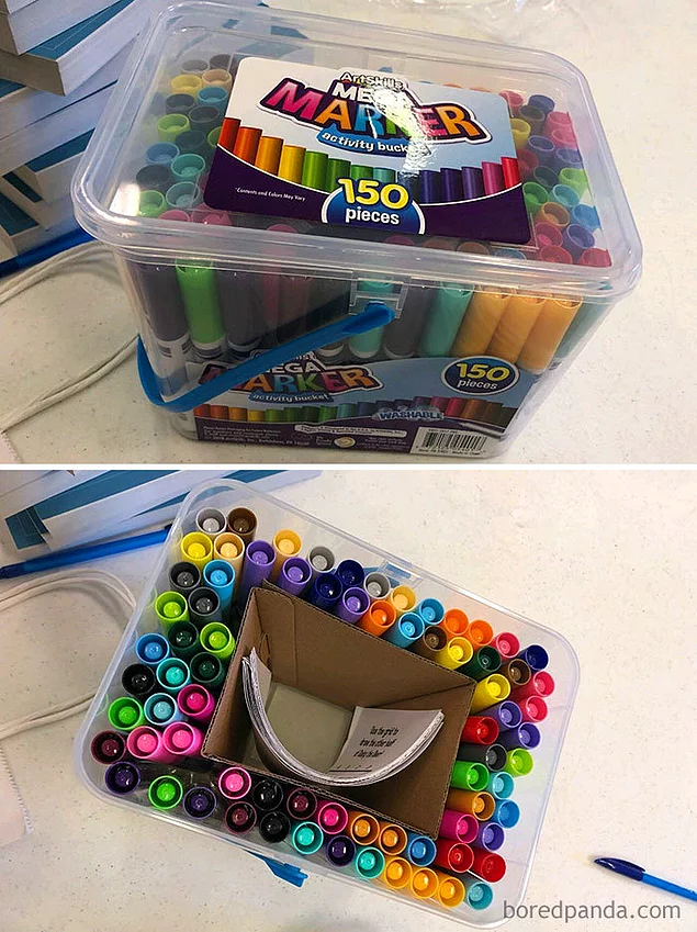
Now let's turn it around! 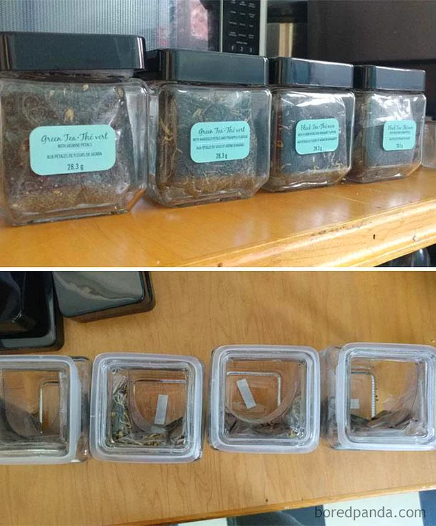
For the one who drew cookies on the package, a separate cauldron in hell is prepared 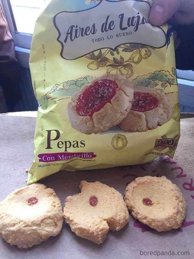
Just look what they are doing! 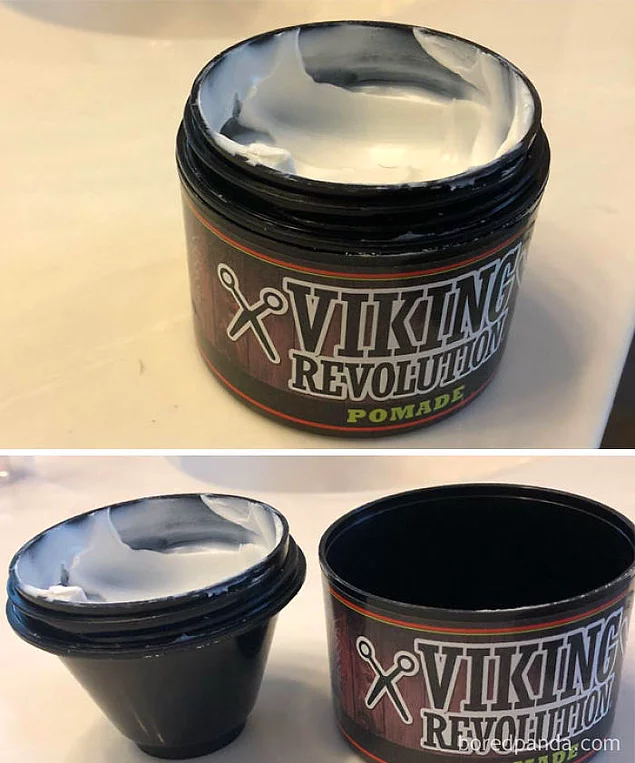
The manufacturers claim that the design of this pen minimizes the use of plastic. 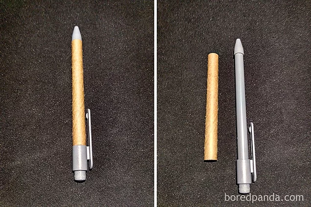
Apparently 27 is "approximately 40" 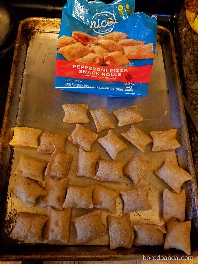
The package says: "Approximately 40 pieces."
Unscrupulous deception of the buyer 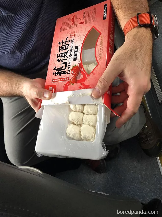
And this happens quite often. 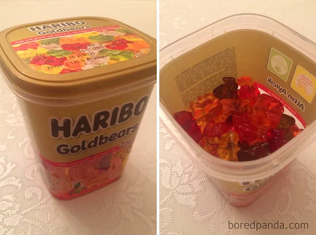
Is that a box of staples or a box of cardboard?! 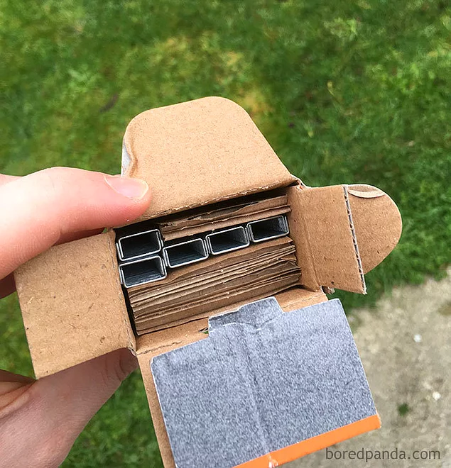
Just save the plastic and make the tube smaller please 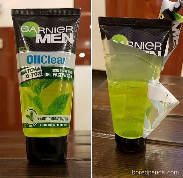
Full of boots of sweets No, wait a minute 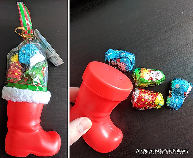
Do marketers have a conscience? It doesn't fit in anymore! 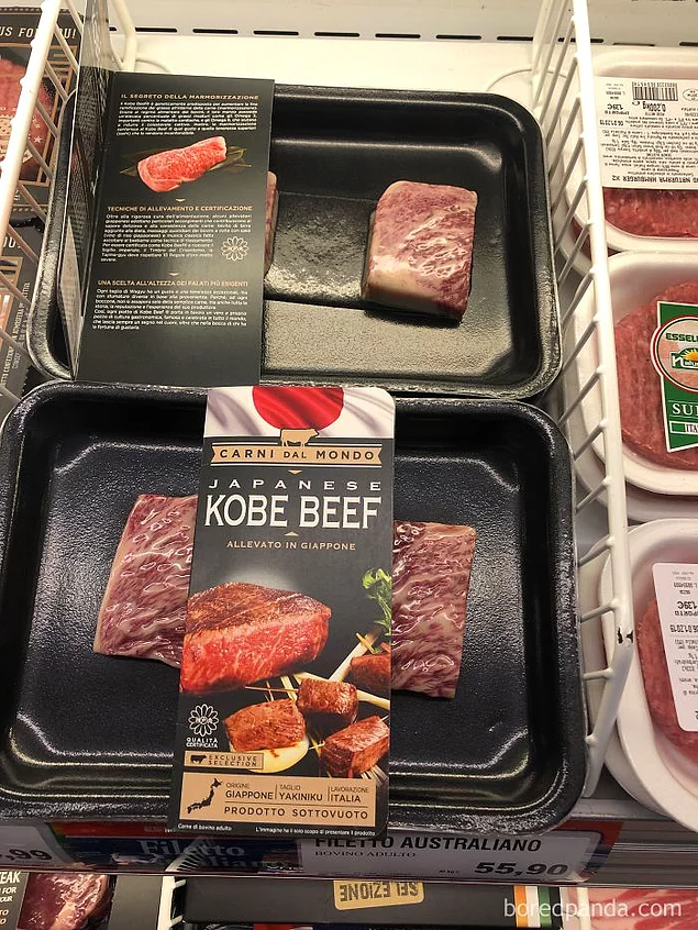
After such a purchase, you may urgently need a fire extinguisher for the fifth point 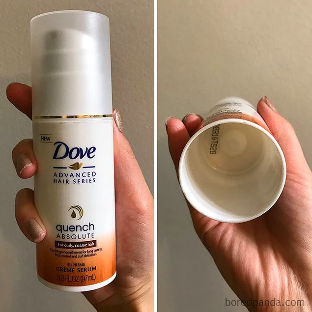
To make the bucket with the construct seem full, the manufacturers put a paper cone there and printed details on it constructor to make it less noticeable 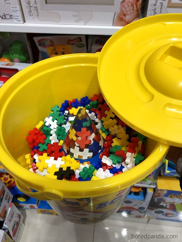
“My 6-year-old daughter spent her pocket money on this and then cried for a long time because“ this is not fair ”” 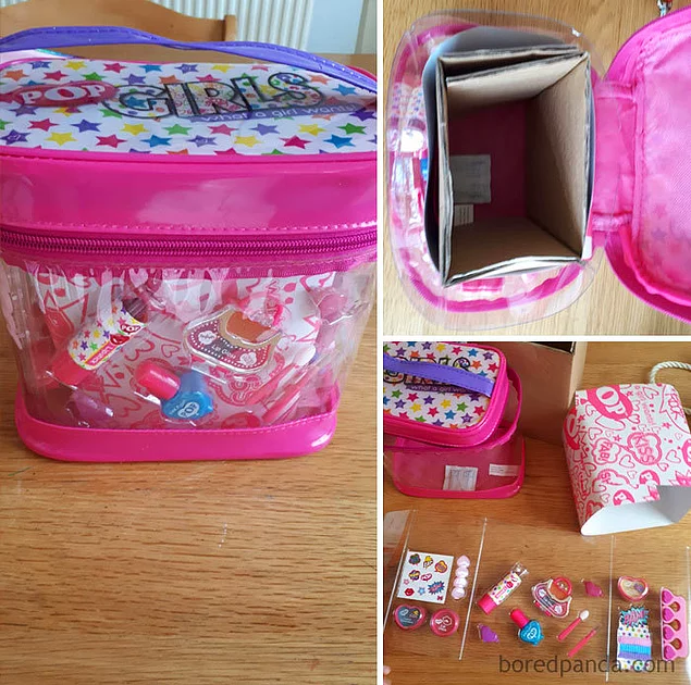
From the packaging, you might think that there are three sausages inside, but there are only two of them. 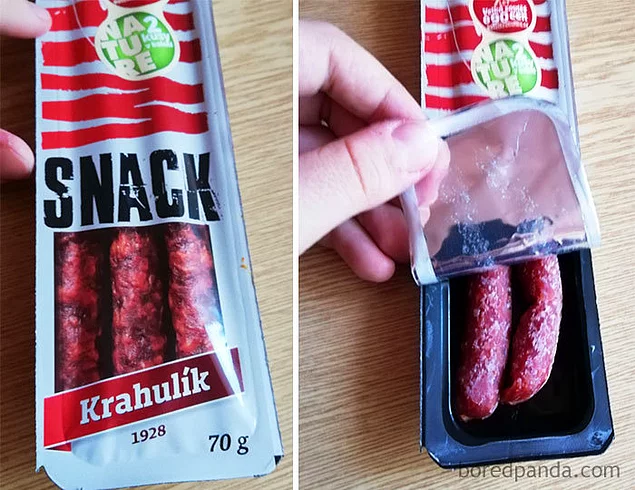
Where are the other 2/3? 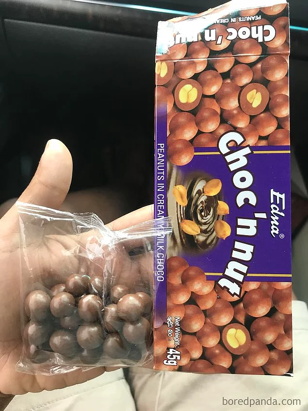
The pieces of chocolate in this muesli bar are only on the visible part of the packaging 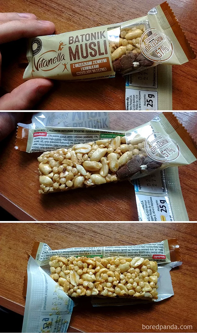
When there is simply no limit to disappointment 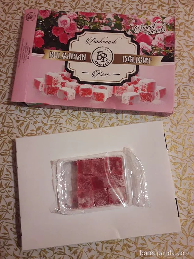
It's disgusting... 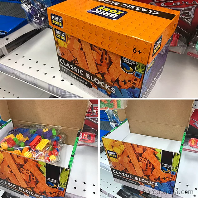
Do you want chocolates? 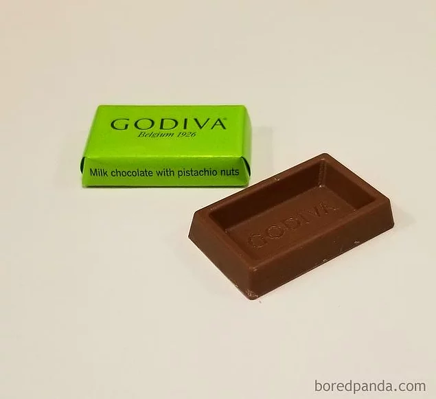
Two identical shower gels. On the one on the left it is written that it is more. That's just 443 ml in it, but in the one on the right, regular, 532 ml 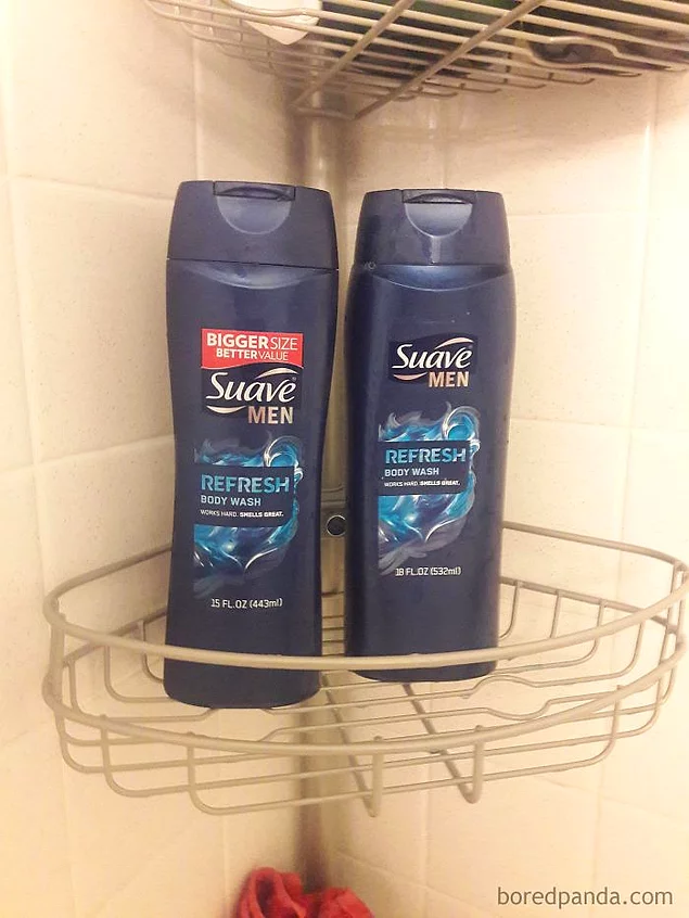





![A hawk "hatch[s]" golf balls, mistaking them for eggs](/uploads/mini/fullstory_related/71b/d430f92ecd927f99daf123f569c0c.jpg)


