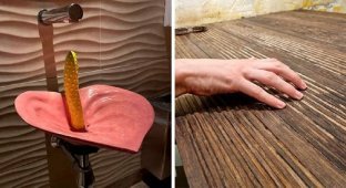
A few examples of ridiculous and strange design, which in The thoughts of the authors may have been good, but reality decided otherwise. 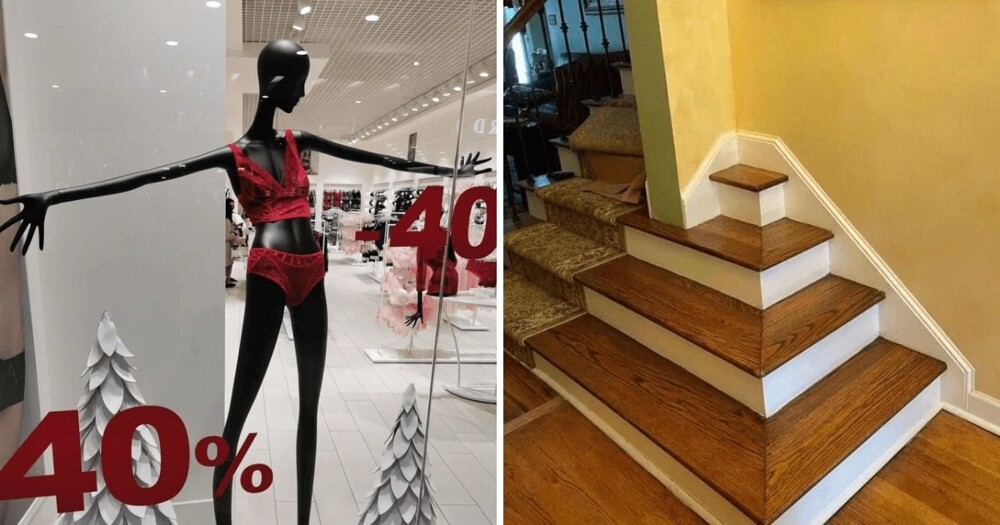
Design is a delicate matter. One slightest mistake - and the whole idea spoiled. And if the designer goes too far with originality, and in the end the object will become completely non-functional - such a design is already can be considered a failure.
Four pairs of legs for three huge bodies 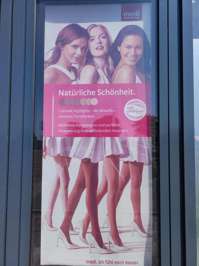
Even more unrealistic standards of beauty that must be met. Man, it's hard being a woman.
In front of an ice cream shop 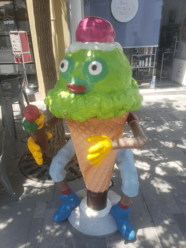
The designers decided that the numbers in order is too simple 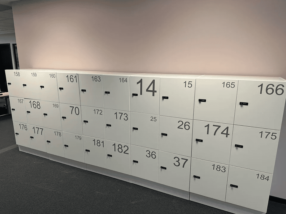
Whose hand is on the girl's back? And what about the fingers? 
SpongeBob has two languages 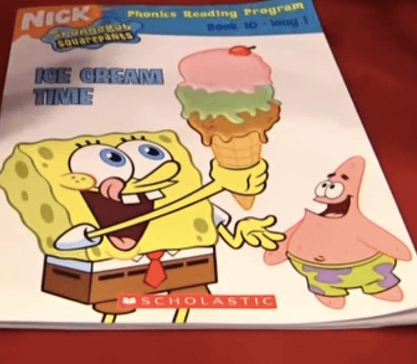
He's just bilingual.
This curved bathroom door lets you see and hear everything behind it. 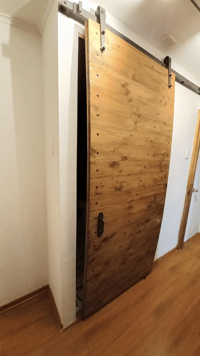
Does a bear have three legs? 
- It's creepy. I do not like it.
— I agree that the sandwich is suspicious. Everyone knows that two slices of lettuce is a lot.
Soda bottle cleaner packaging 
If the package design needs additional sticker on top that says "No Drinking", maybe it's time to completely rethink design.
Transparent surprise egg 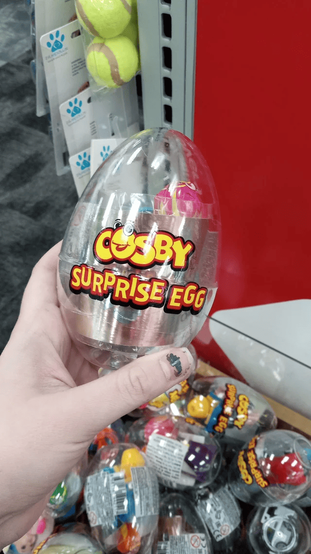
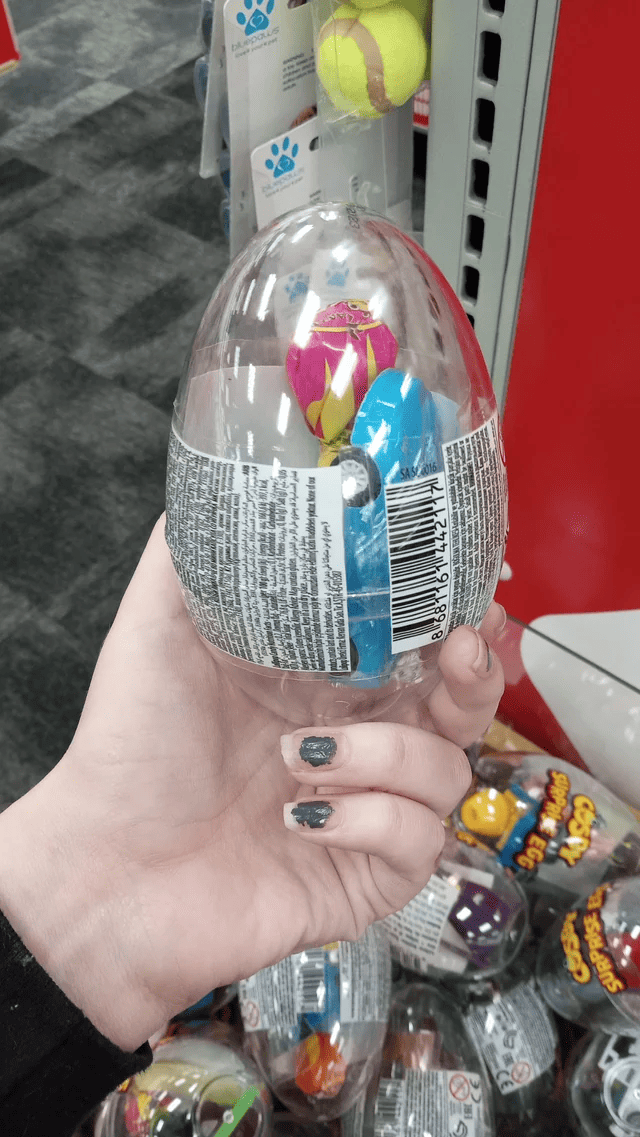
There will be no surprise.
And where to go? 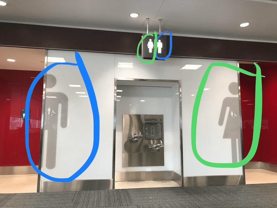
In front of my eyes, the guy went into the wrong toilet at the airport. He was looking at the top sign.
Worst Design Winner 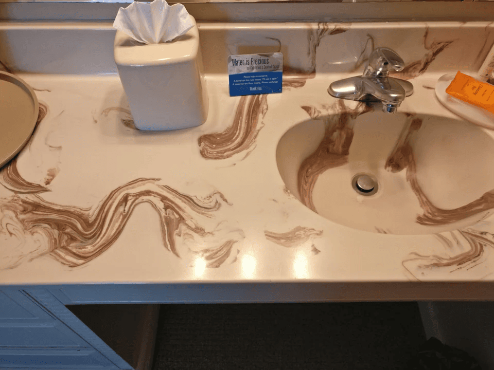
Sinister Minnie Mouse 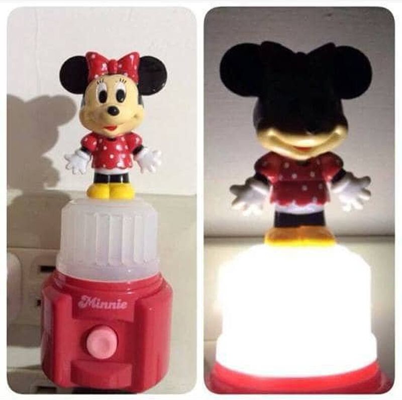
Unusual mannequin 
Finally some underwear for real interdimensional void creatures!
Ads that don't need comments 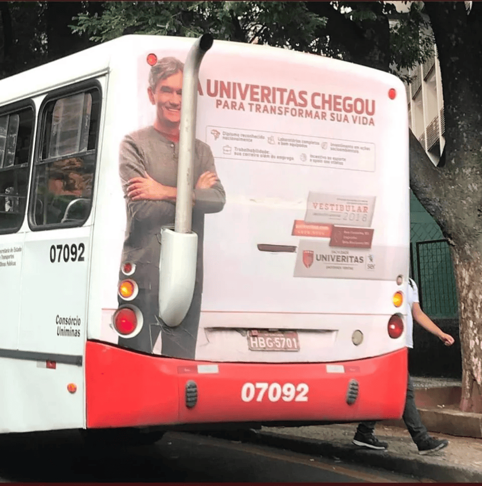
This was a very bad idea. 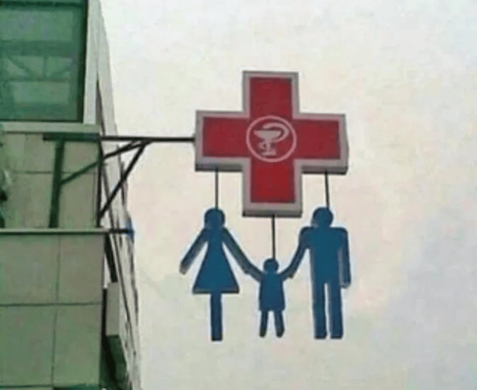
Why does the mother have only one leg?
Did not work 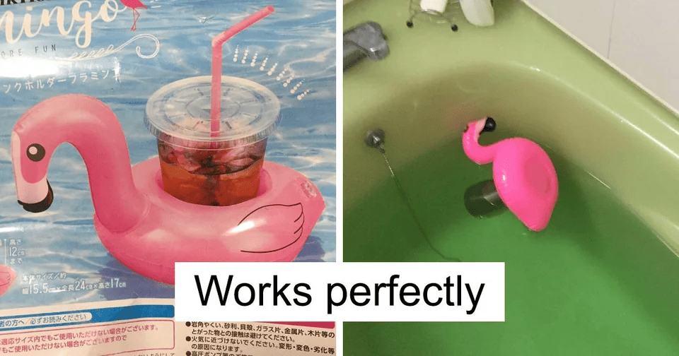
He tries his best. He is great!
Okay, but why? 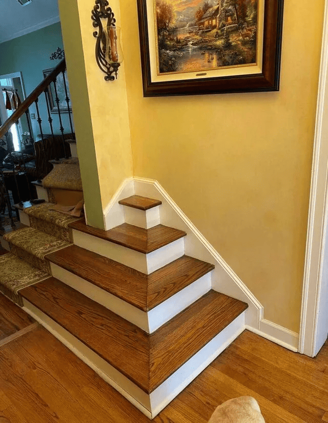
— It's a built-in plant stand!
No, it's for the cat!
Add your comment
You might be interested in:


