30 times logo designers should have taken a closer look at their creations (31 pics)
The logo is an incredibly important thing, because it is almost the first what the customer sees when they get to know the brand. It turns out that the designer huge power turns out to be in the hands - only not everyone uses it in good... 
1. “Ordered the Jordans online. Came fake, with an ass on the logo" 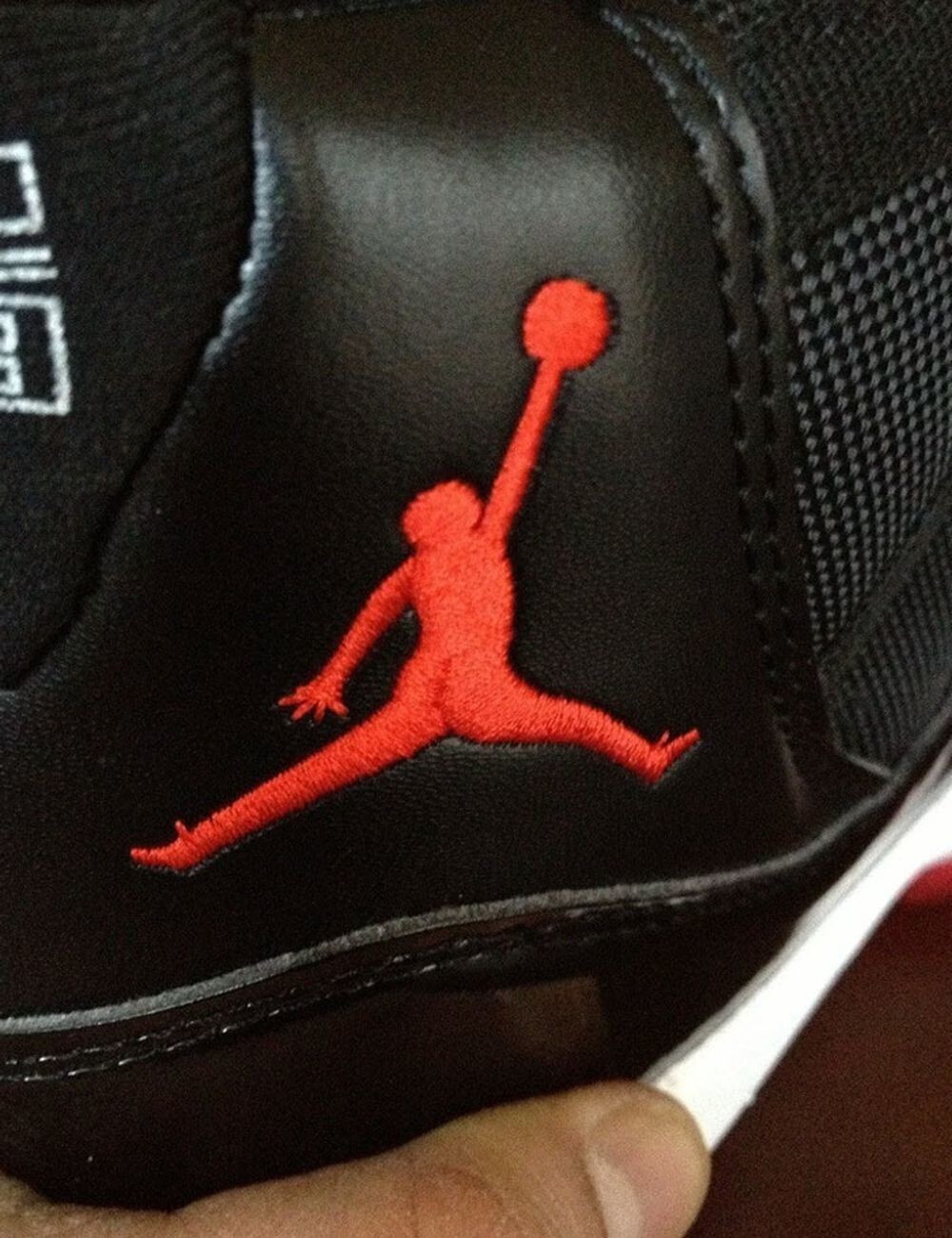
2. It's just maple, from which syrup is extracted. What did you think? 
3. Believe it or not, this refers to a glass with a straw sticking out of it. 
4. If you flip the iSmart logo, it turns out "+ Jews" ... Thank you at least that's not a minus 
5. Don't make it up, it's just a handball club logo 
6. The name of the FitForever fitness center, "Always Fit", is suspiciously similar to FatForever - "Forever Fat" 
7. “Logo at my local doctor’s clinic” 
8. Failed Facebook Logo Placement Turned Art Sounds Into 'Fart Sounds' 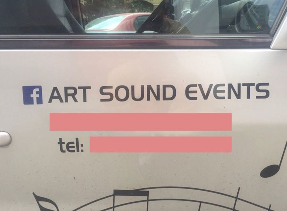
9. Logo of the Youth Commission of the Archdiocese in 1973. The Catholic Church has its own atmosphere ... 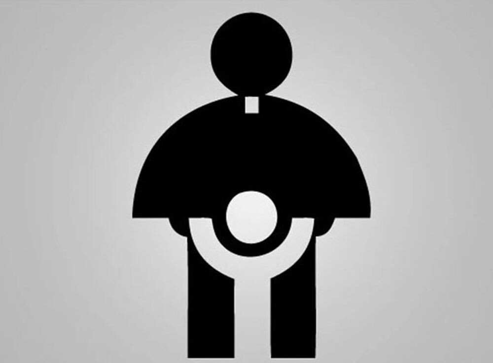
9. ...and the Turkish bottled water brand apparently took a cue from her. 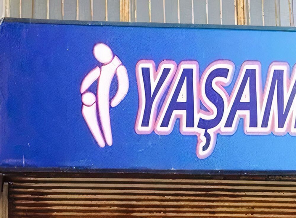
11. The store is called "Jupiter", but they have a moon on the logo 
12. Someone should have said “Yes, the family is on the gallows - great logo for our pharmacy!” otherwise how to explain it? 
13. This would be a great logo for a porn site. 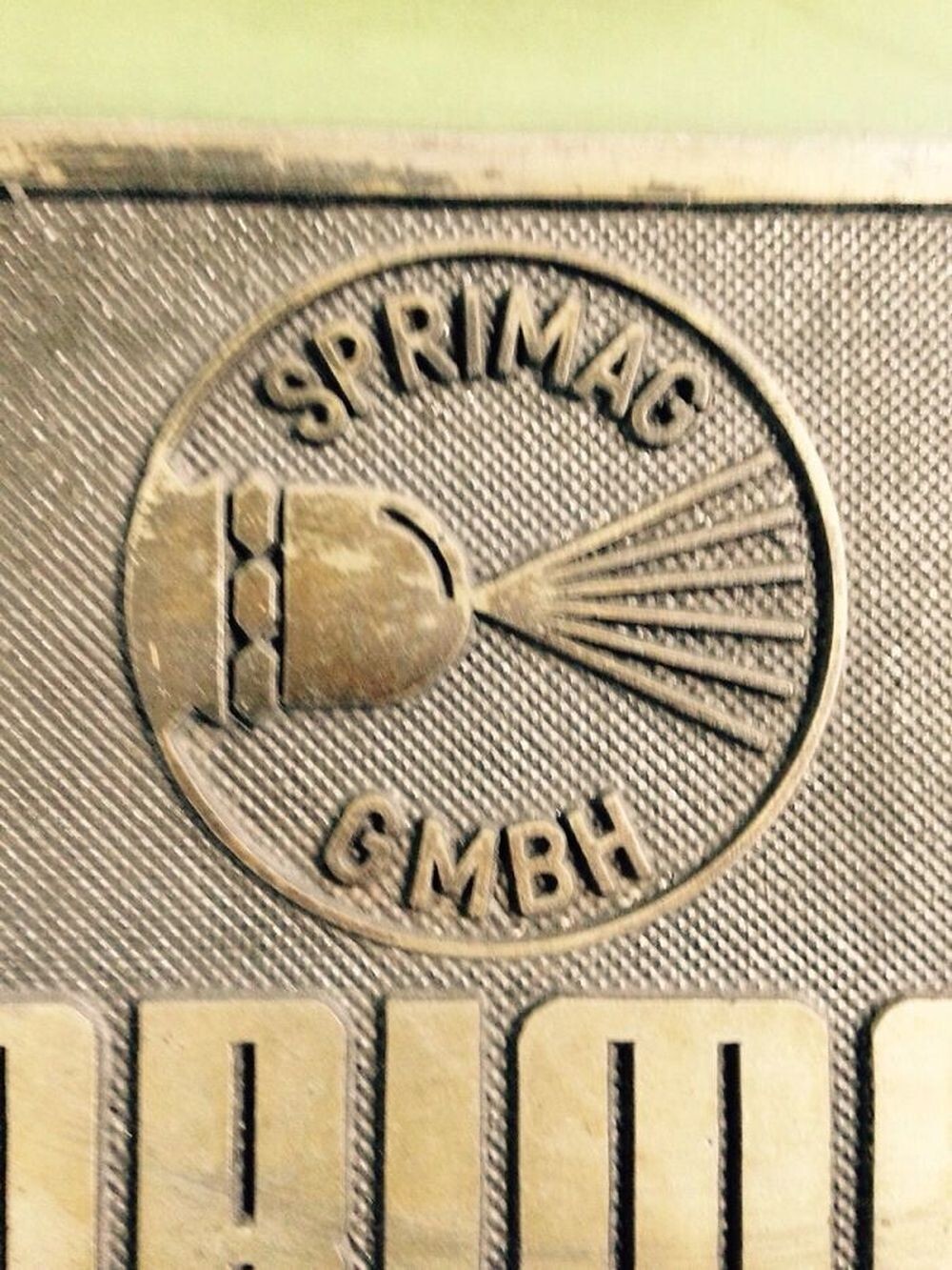
14. Somewhere one designer is still giggling vilely 
15. The logo of the children's hospital. As planned, a person plays with children, but it is worth turning over, and he already tramples them furiously 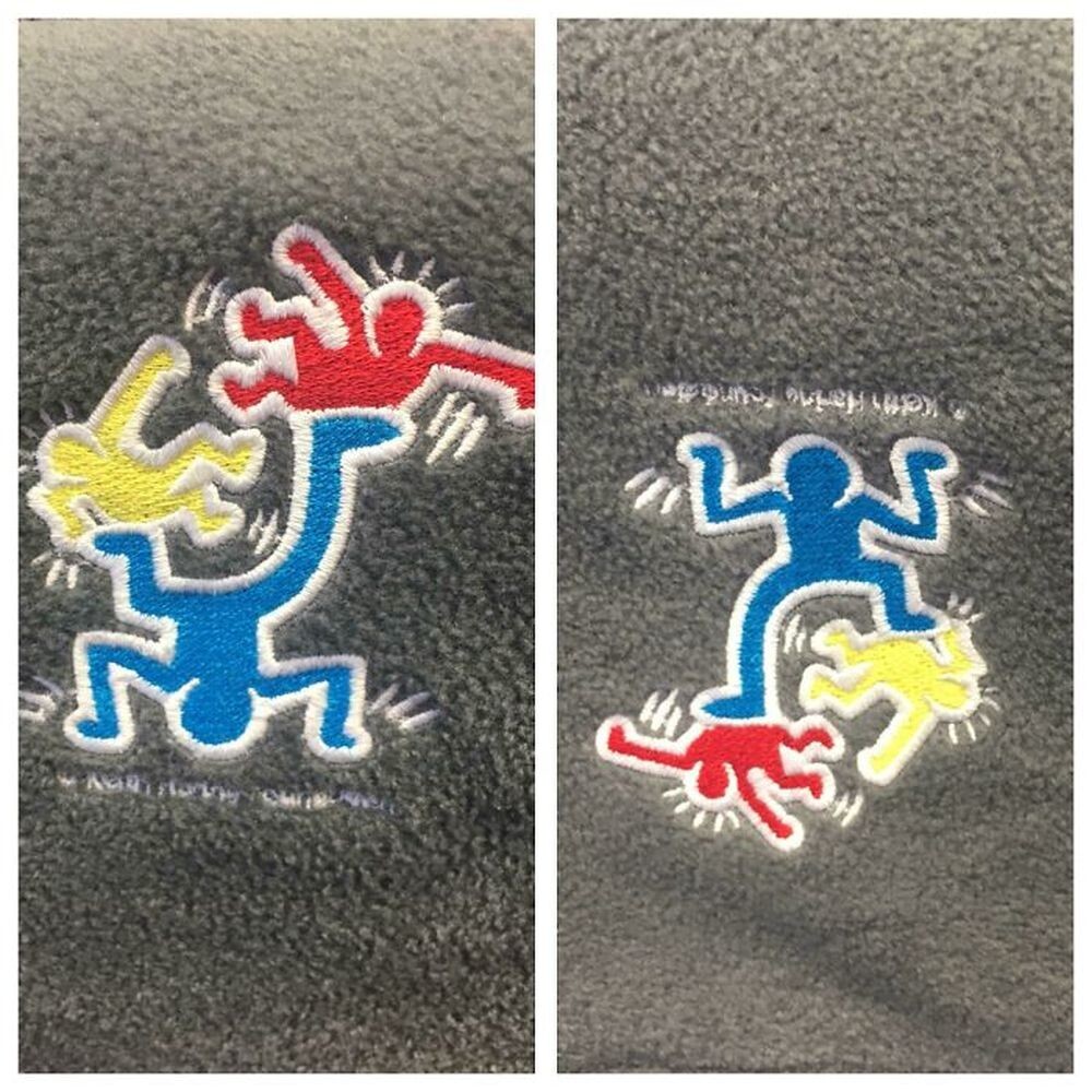
16. It would seem, where is the bull, and where are the women's panties, but here ... 
17. Uncle, are you sure you are a dentist? 
18. Olds will see a classic wired mouse, the rest ... 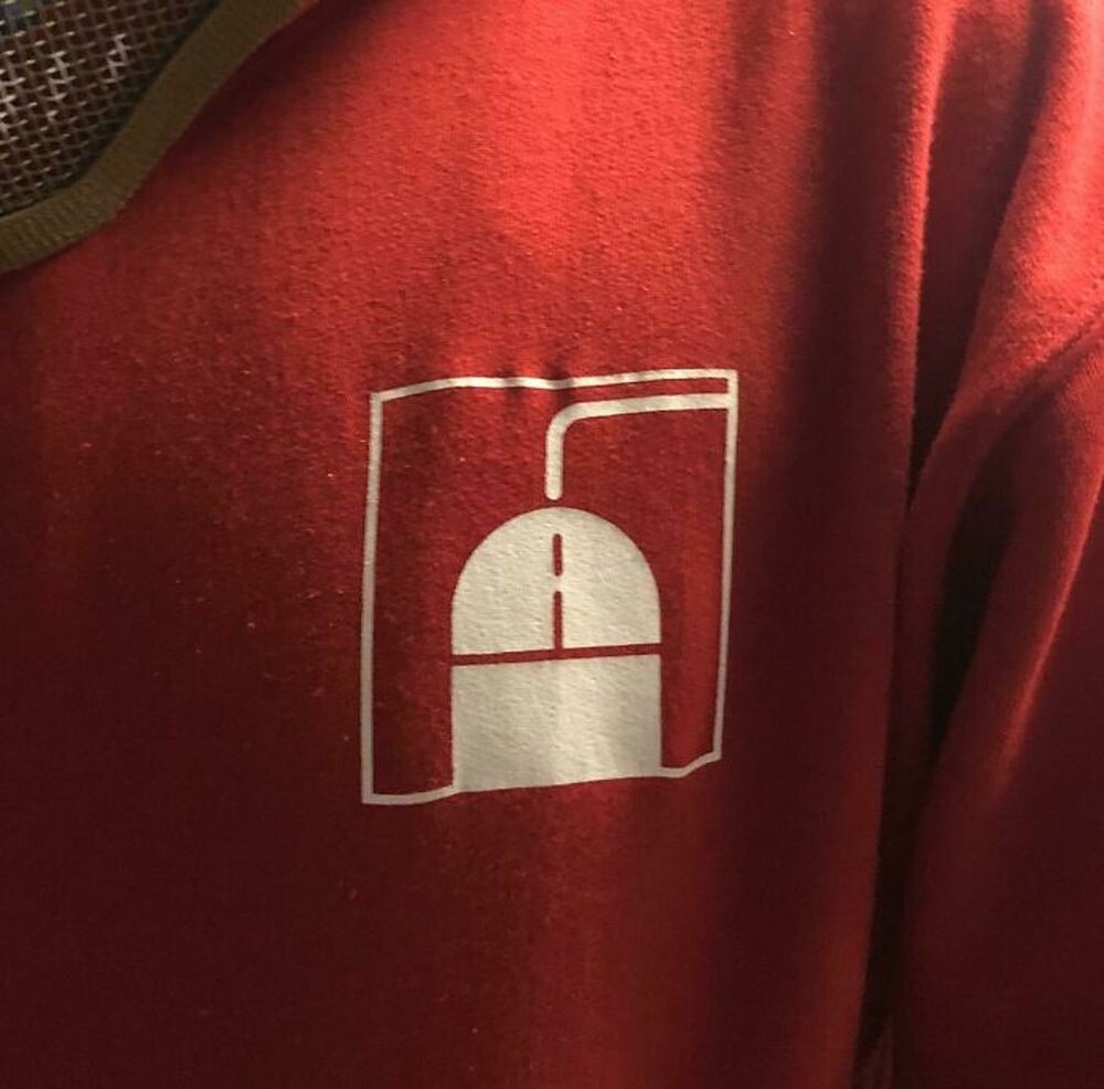
19. The logo of the Czech manufacturer of sausages - the case when mayonnaise clearly should have been replaced with mustard 
20. What is taught in this studio, mutations? 
21. Cass Toys didn't think too well about their logo design... 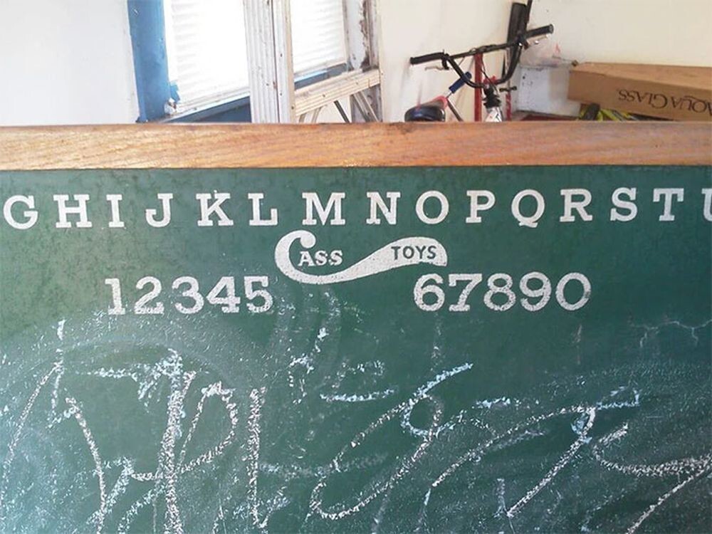
22. The logo of the plastic surgery clinic - you might as well call it "Picasso" 
23. Question for connoisseurs: how long will a sushi restaurant with such a logo last in 2023? 
24. Children's organization logo with bullet holes - USA only! 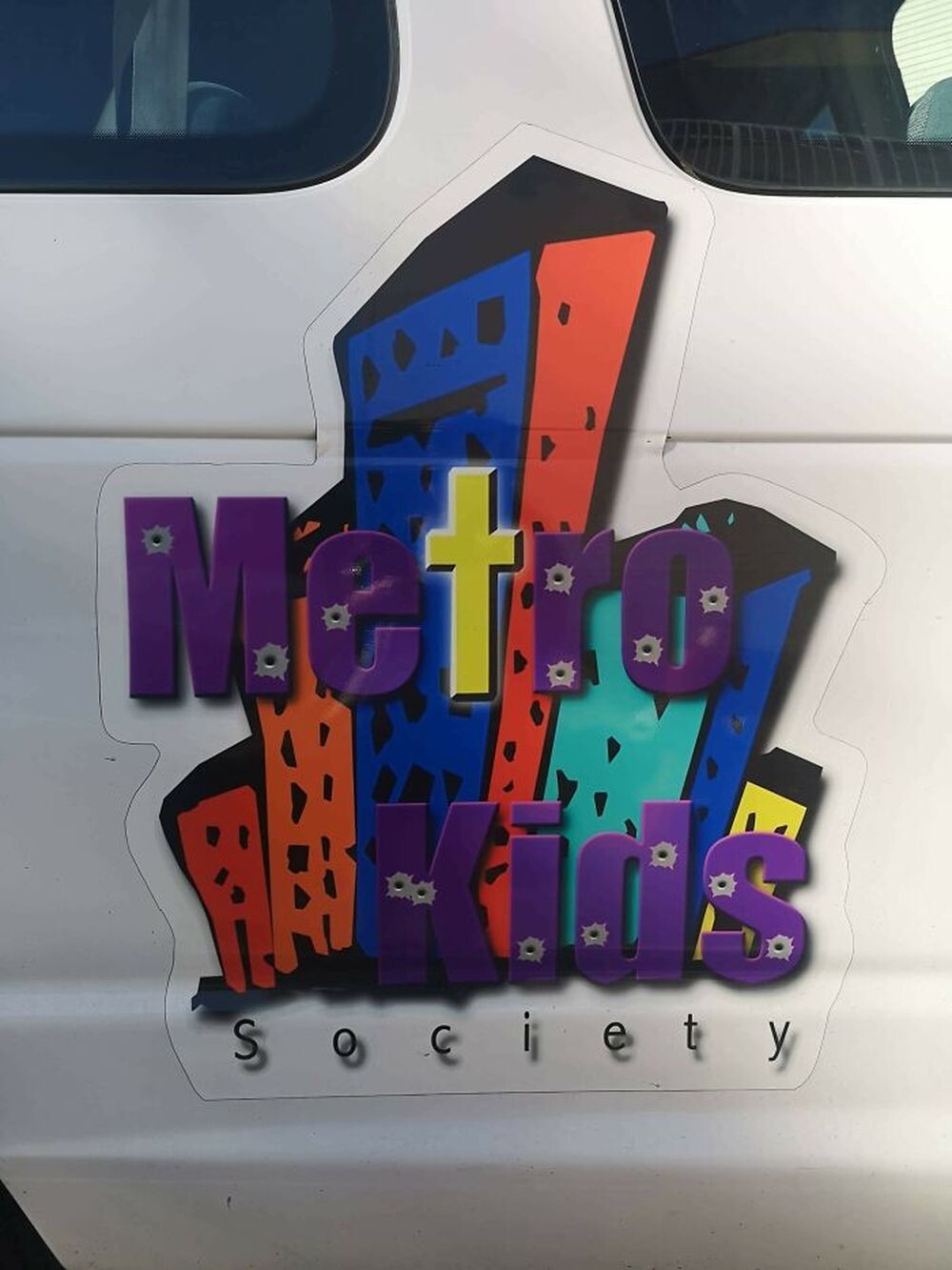
25. You don’t even know what is worse - what the king is doing with this horse, or the fact that he suffers from diarrhea in the process. 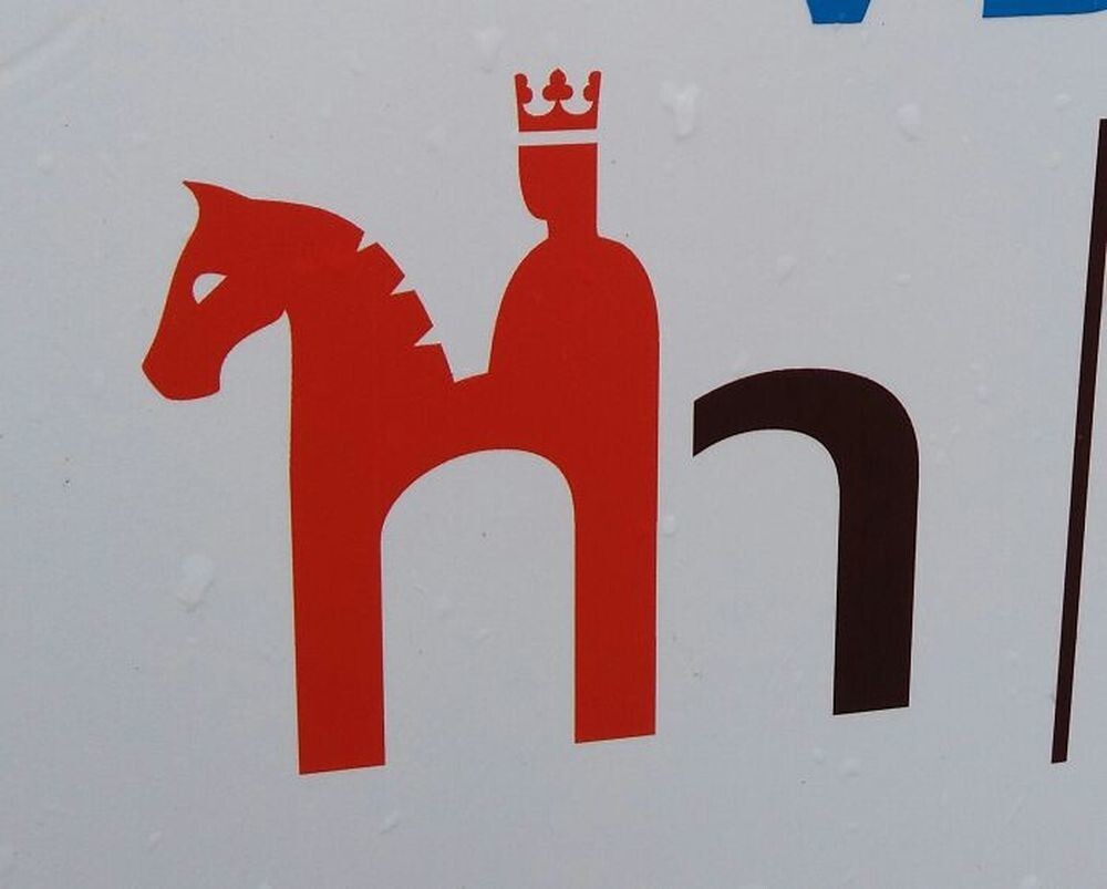
26. Does anyone else see three guys in a jacuzzi? 
27. But someone was paid for it ... 
28. Clever logo of a pet store: like a cat and a dog, but like a dead bird with its belly up... 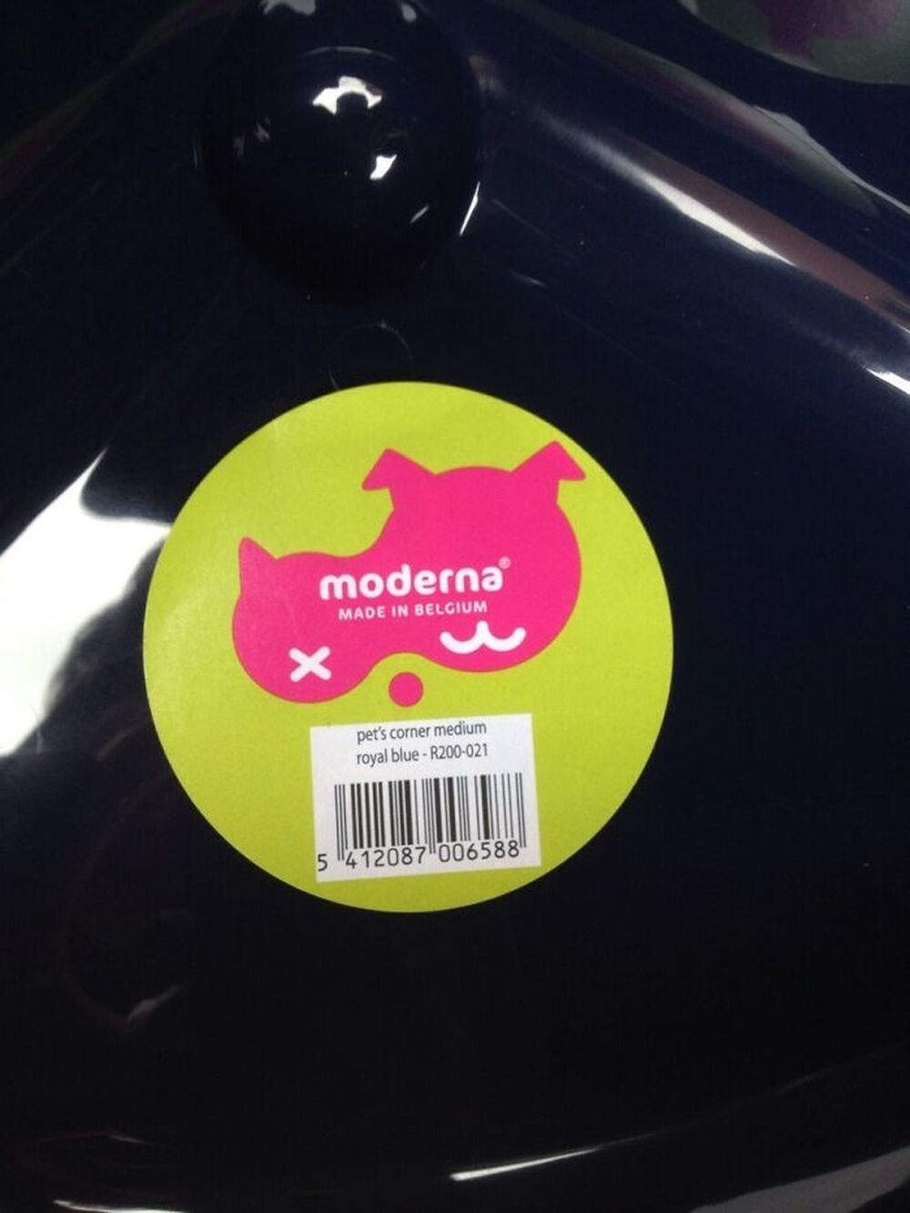
29. This Is Why Aliens Ignore Our Existence 
30. The phrase "Your design is shit" has never been so relevant. 


