25 logos that cause unnecessary associations, bewilderment or healthy laughter (26 photos)
Drawing a good logo is not easy. If you want to get a result for which you are not ashamed, you should not save on marketing analysis and graphic design. Or it will come out, as in this compilation: the designer drew something, the marketer either did not look, then Li did not think, but the head approved without looking. Familiar? 
1. The emblem of the Catholic school 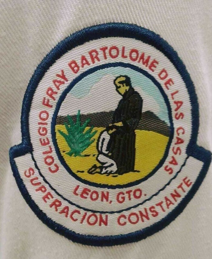
2. Unnecessary associations 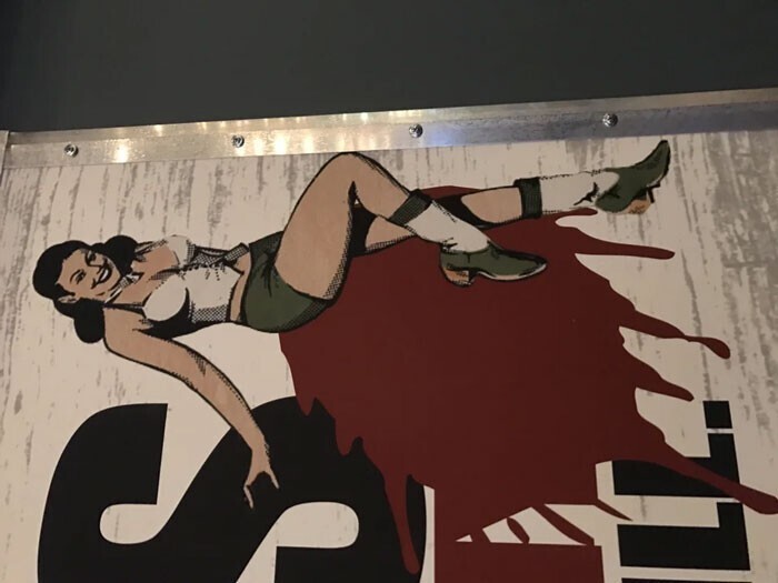
3. Logo for spicy apple jelly 
4. The logo of the medical center is a peak turning into a straight line 
5. Burger logo. original 
6. Extremely unfortunate location of the logo. With the door open, it reads like "I love dick" 
7. An ambiguous logo for a fitness center. Either "slender forever" or "fat forever" 
8. From the same series: either "jazz fans" or "sperm fans" 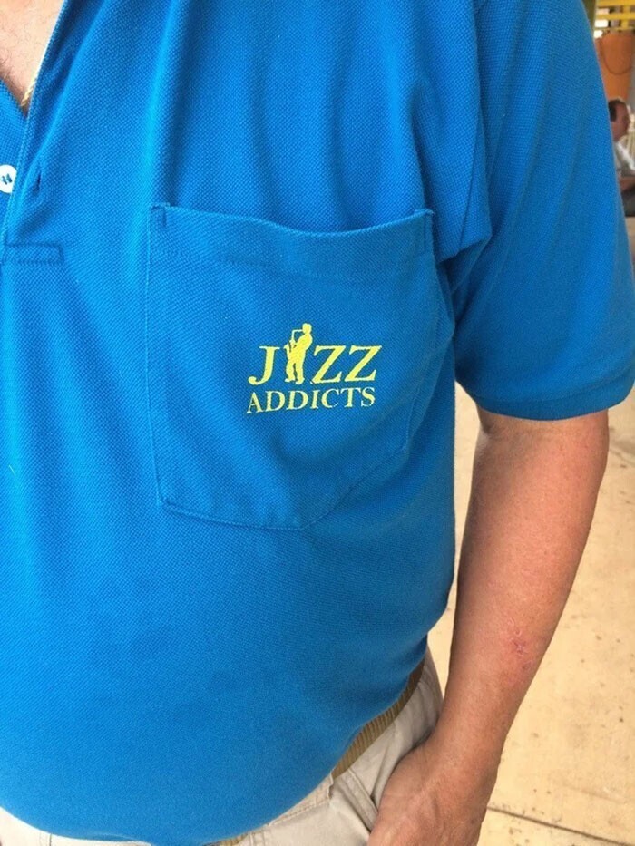
9. It doesn't read "Hello baby" but "Hell baby" 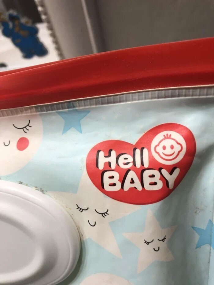
10-. Women's water polo team logo 
11. Promising cheerleading school logo 
12. Water company logo. These are the plumbers! 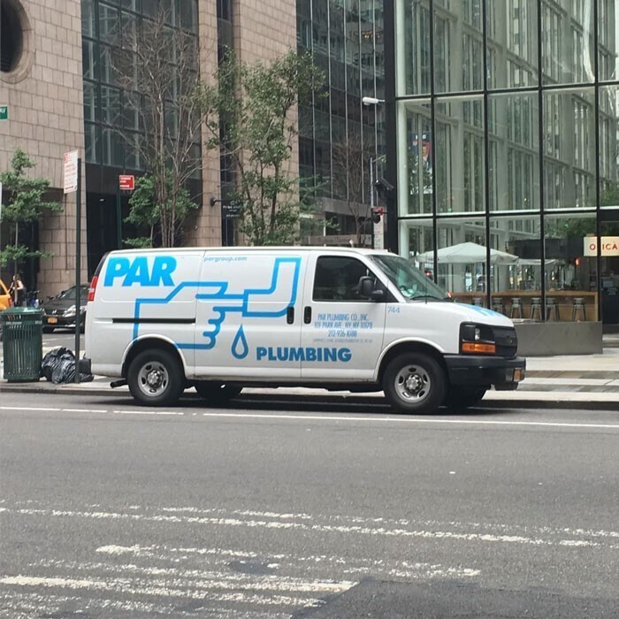
13. Yogurt with a biohazard symbol as a logo on its packaging 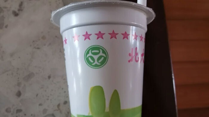
14. The logo of this company looks like someone has been sucked into a lathe. 
15. In a dry pool, the rule "No back flips" applies, at the same time, the back flip is depicted on the logo of the game center 
16. "I drink children" 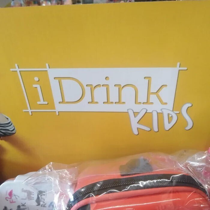
17. They really should change their logo. 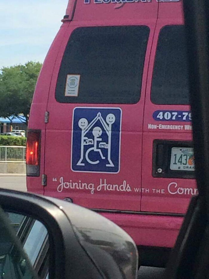
18. Turkish water brand logo 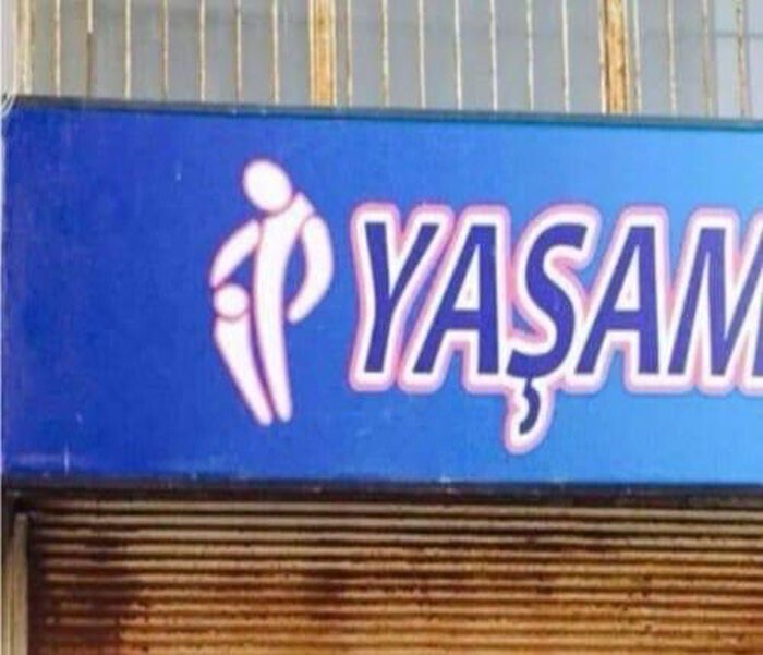
19. A separate category - logos of increased creativity. In someone's head they look classy and cool 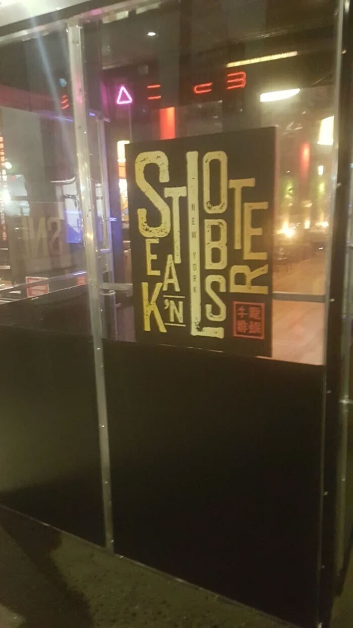
20. What is written here? And what does the man do? 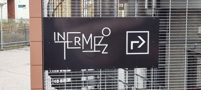
21. 3lje or Blue? 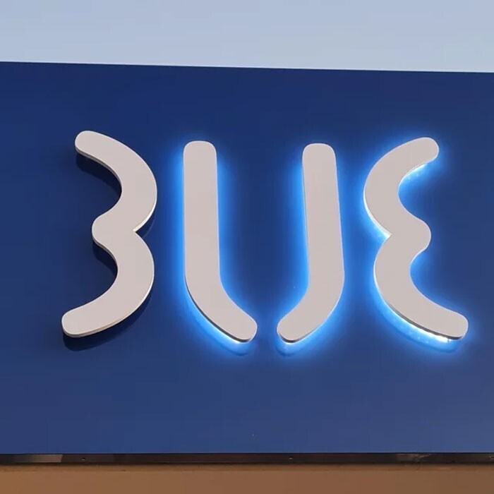
22. Cartridges For Kids logo. It remains to substitute one letter, even a baby can handle it 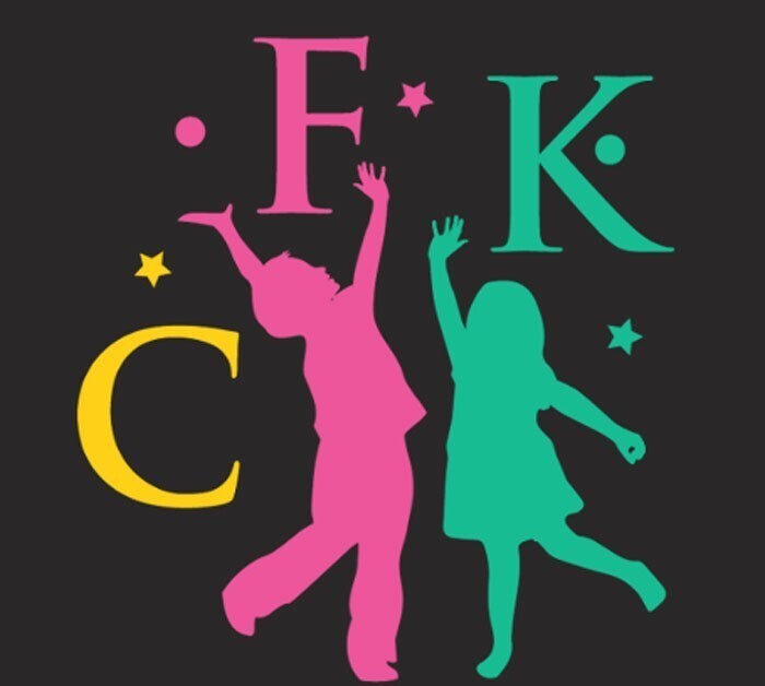
23. It says "Frescura" (Freshness) 
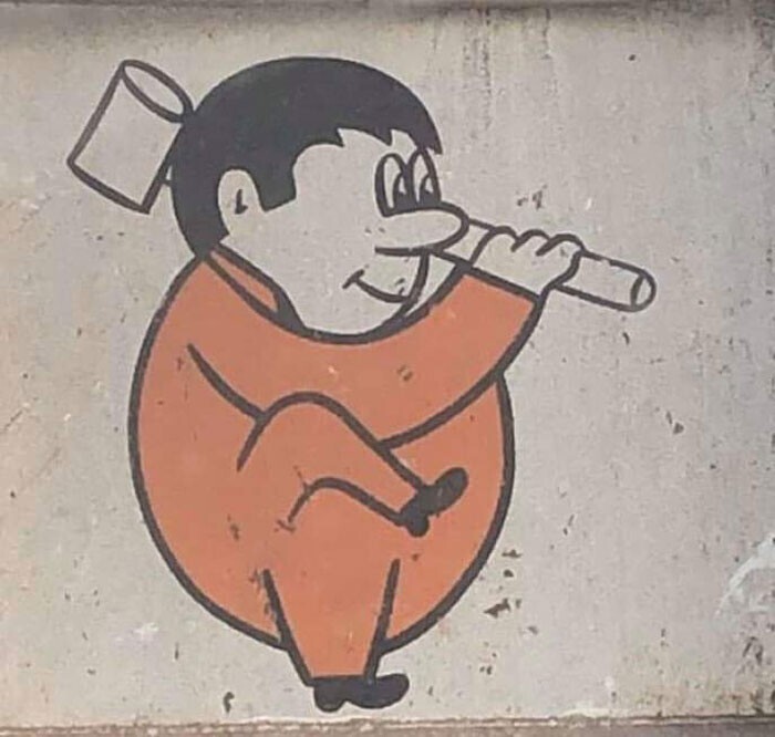
24. How does it read? Hint: SPYM 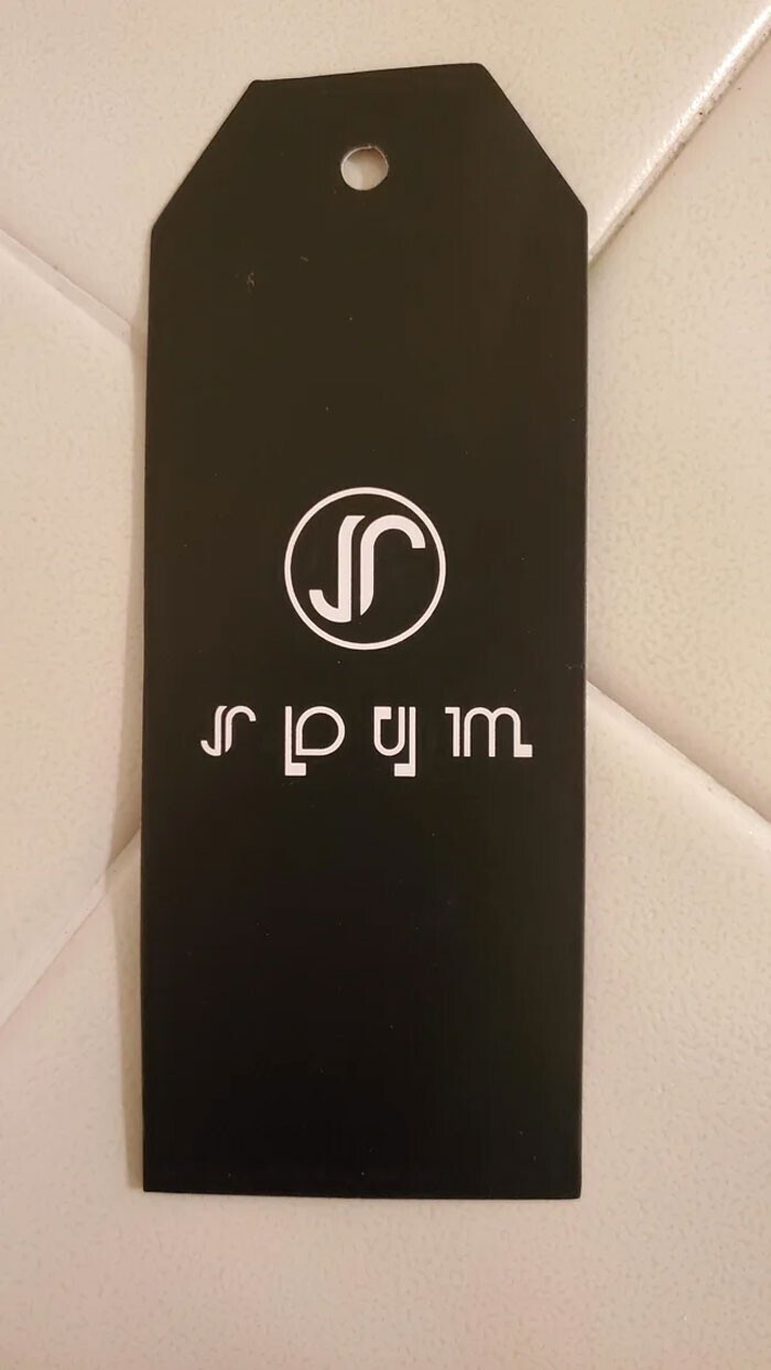
25. Let's end on a cheerful note. This is the logo of a demolition company. 