17 cases when the work of designers went down the drain and turned into a failure (18 photos)
Sometimes people who design things get a lot of questions. Why, for example, are instructions written in a completely unreadable font? Or why do children's toys look so scary that even an adult would be scared? 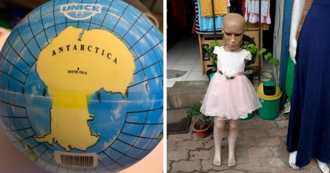
This backpack has an Elsa mask that you can wear on your face 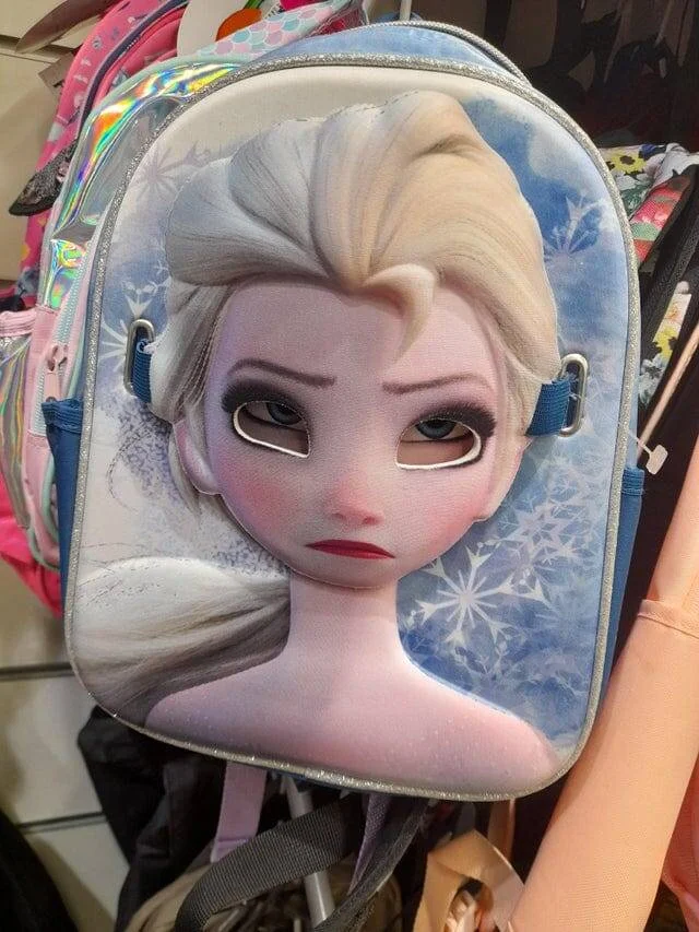
But when it's on the backpack, it looks like Elsa is dead inside.
I bought the bag online because of the cool front pocket. And the pocket is fake 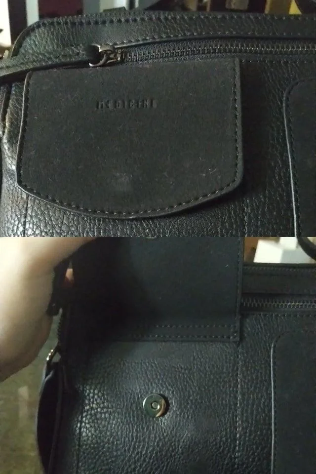
Children's mannequin 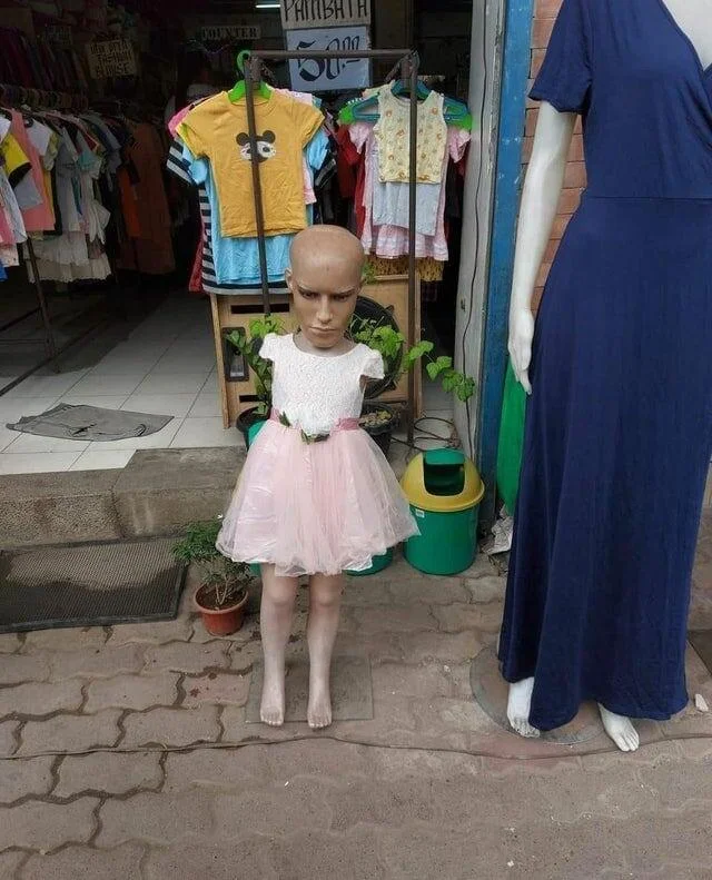
By the way, we have a whole selection of weird creepy mannequins.
I wonder how often this laptop will turn off because the buttons are accidentally mixed up 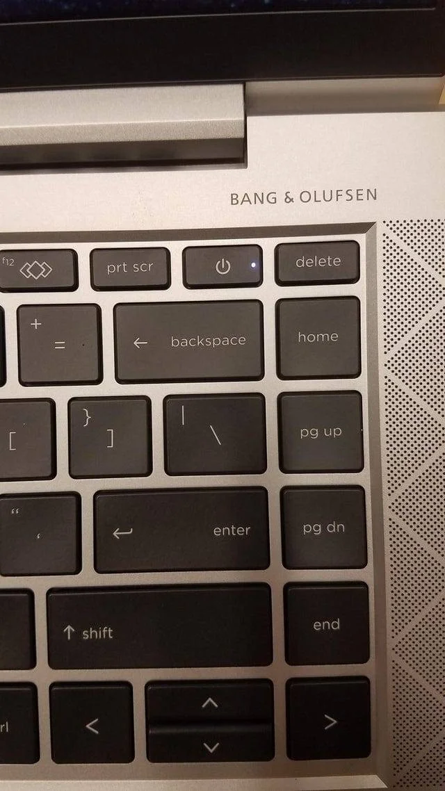
Everything is visible, everything is clear 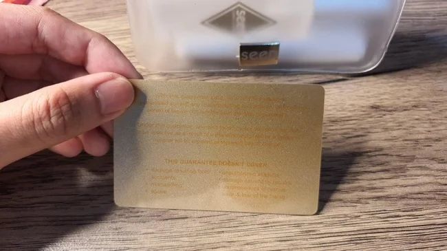
It's me, Lyokha, get me out of dogs 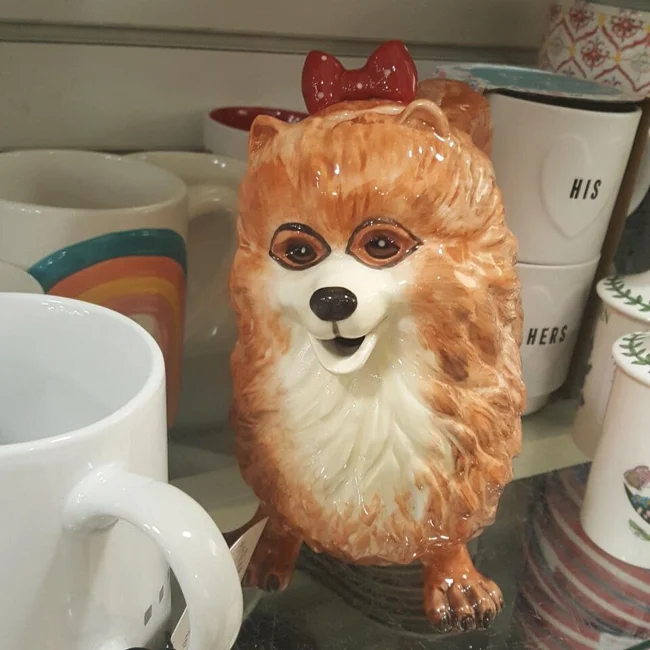
Part of the face and the mirror wall are not a good solution 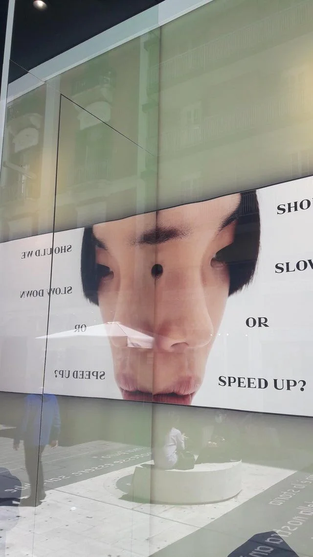
Something out of a horror movie 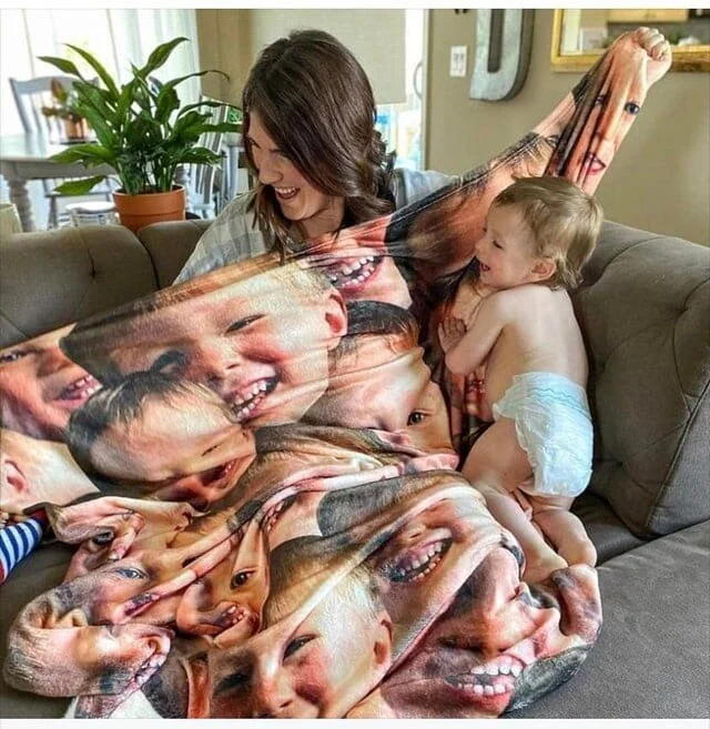
The drawing on the table looks like stain 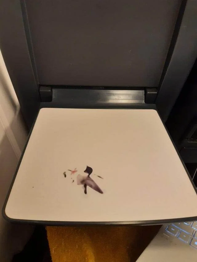
The "design" of these Starbucks cups just looks like dirt. The one on the right is just water 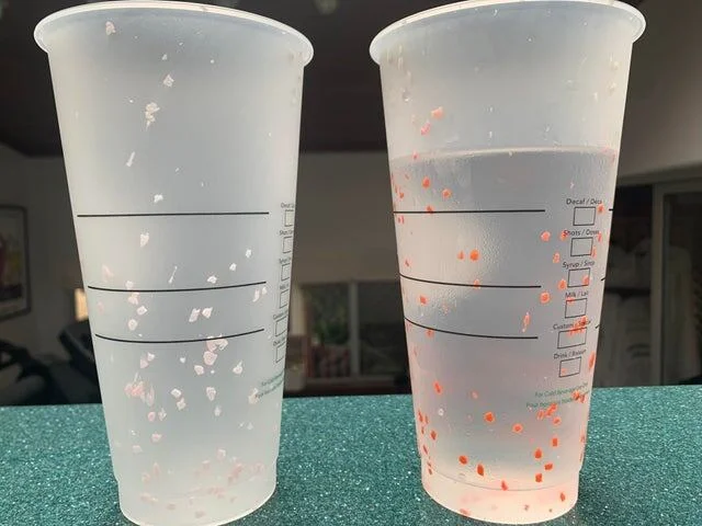
A cup that always looks dirty 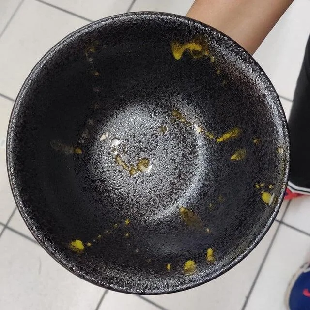
Poor Messi 
Insidious towel 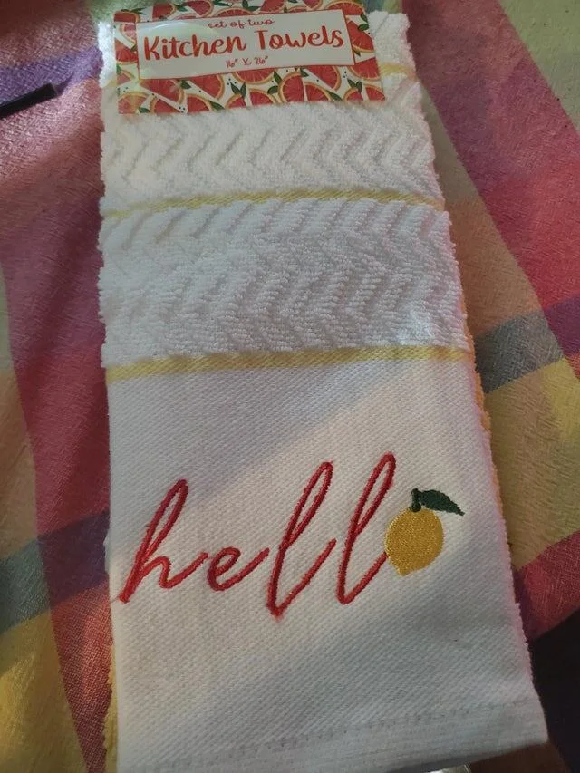
When "hello" became "hell".
The instructions are written in black font over dark blue liquid 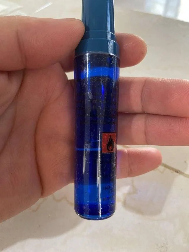
A hook that gives rise to unnecessary associations 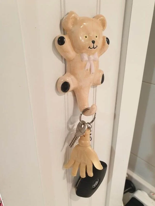
It seems that the tower should have been instead of the letter "A" 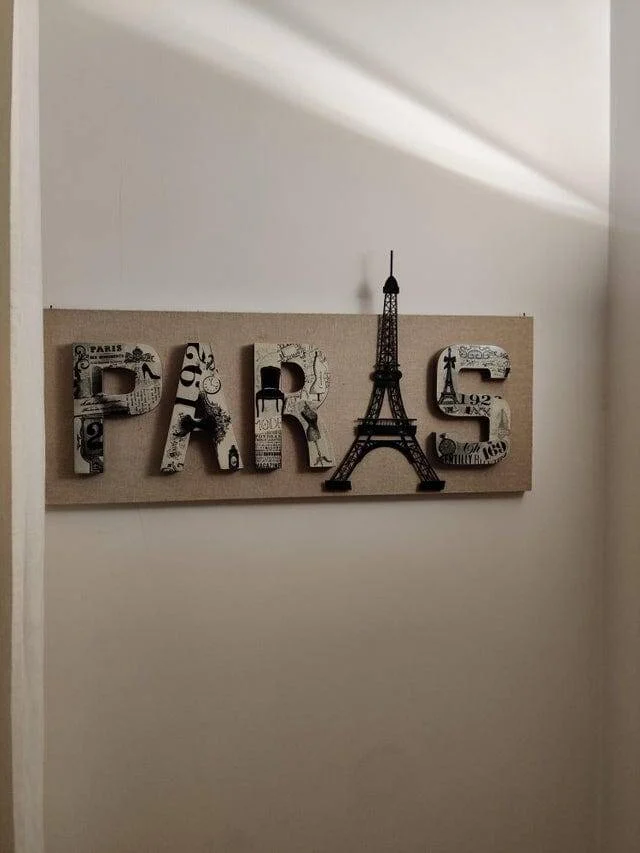
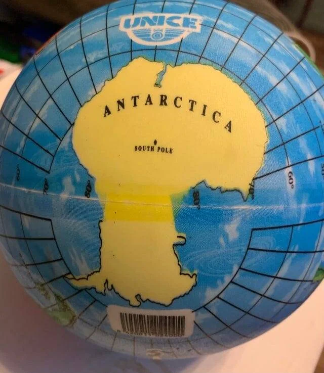
Antarctica is too long 