How the logos of popular social networks and instant messengers have changed (10 photos)
Come up with a logo. It would seem, but what is so complicated here? But in In reality, this is a very complex process that requires careful thinking and planning. If you screw up, you can bring on yourself more criticism from users, which will lead to a churn audience. However, many companies, even in the event of a miss, still stand their ground, waiting for the people to get used to it and stop whining. Let's take a look at how the logos of popular social networks have changed and messengers that have been familiar to us for many years.
ICQ (1998-2014/ 2020 to present) 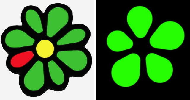
Many companies decide to change their logos to make them simpler and more modern. However, these are not always innovations are successful. For example, many ICQ users really disliked the design updates. They think the new logo now looks too gloomy and unrecognizable.
VKontakte (2006-2012/ 2020 and to date) 
Skype (2003-2004/ 2019 to date) 
Twitter (2005-2006/ 2012 to present) 
Odnoklassniki (2005-2011/ 2011 to the present day) 
Telegram (2013-2014/ 2019 to date) 
Snapchat (2011-2013/ 2019 to date) 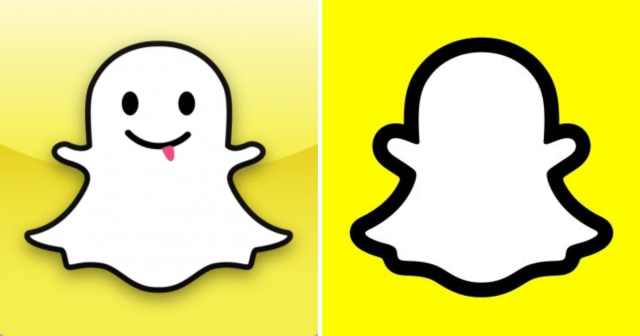
QQ (1999/ 2017 to present) 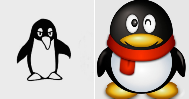
QQ is a popular instant messaging service that is heavily used in China.
Discord (2015/2022 to date) 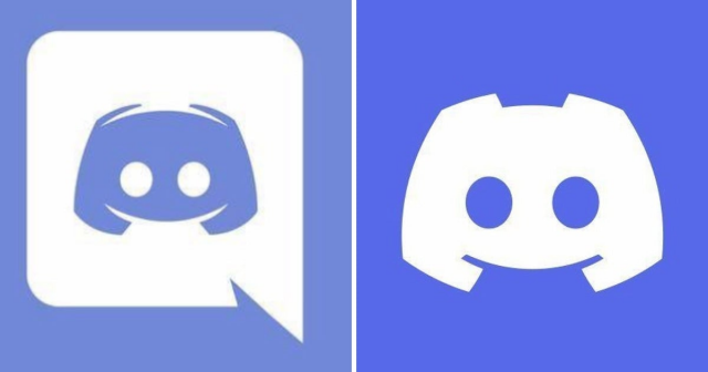
Pinterest (2010-2011/ 2016 to date)